Project type Concept branding & identity design
Client KITE (Fictional brand)
Date 2025
Tools used Midjourney, Photoshop, Affinity 3
Project goal Create new brand identity for fictional health/tech company KITE
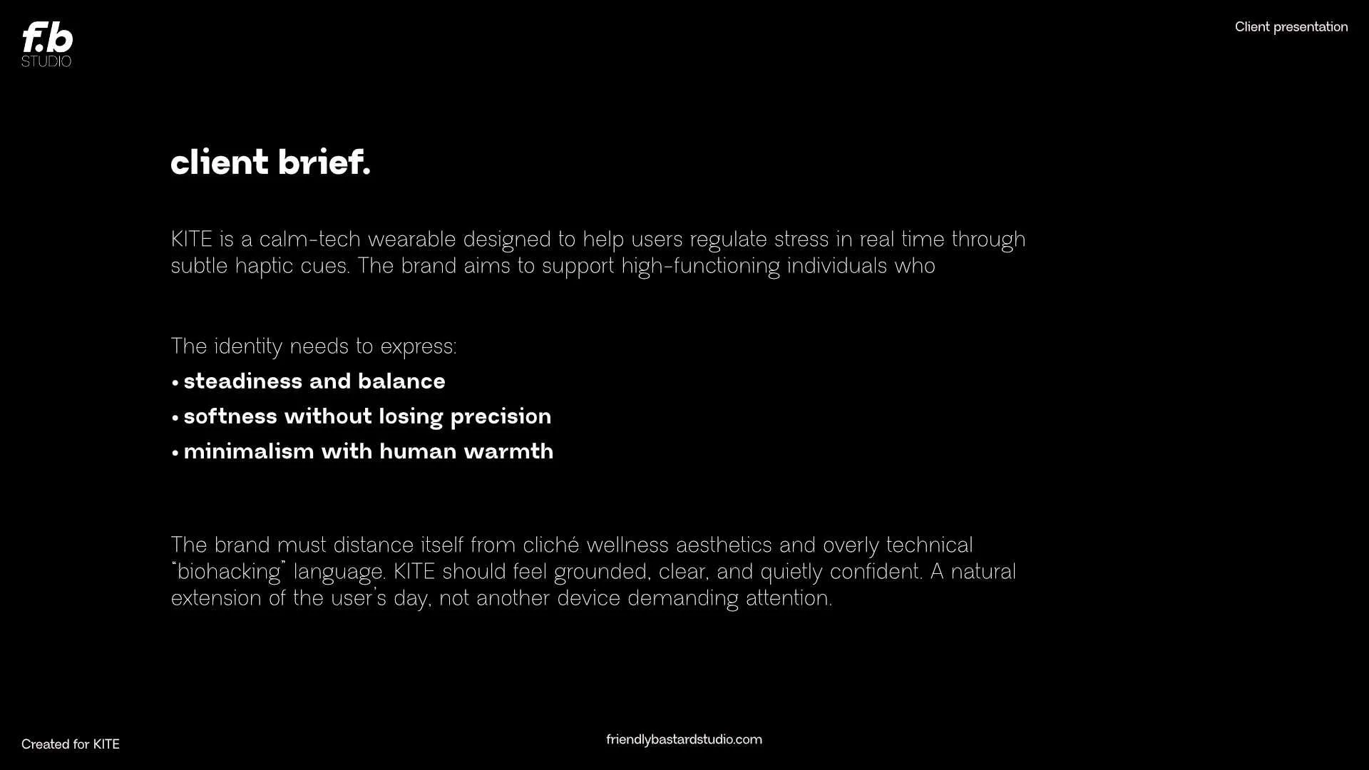
the project.
(full brief below)
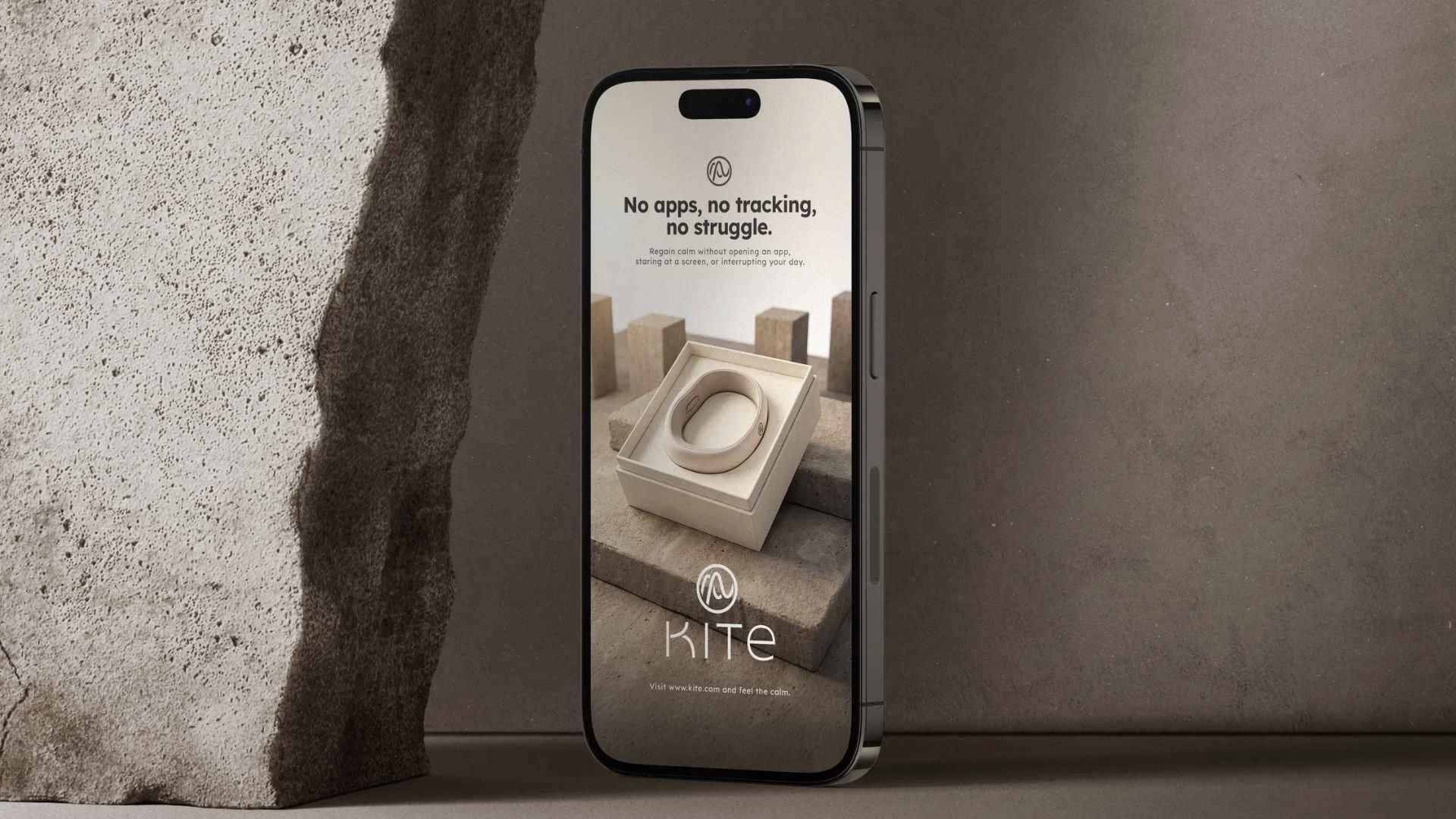
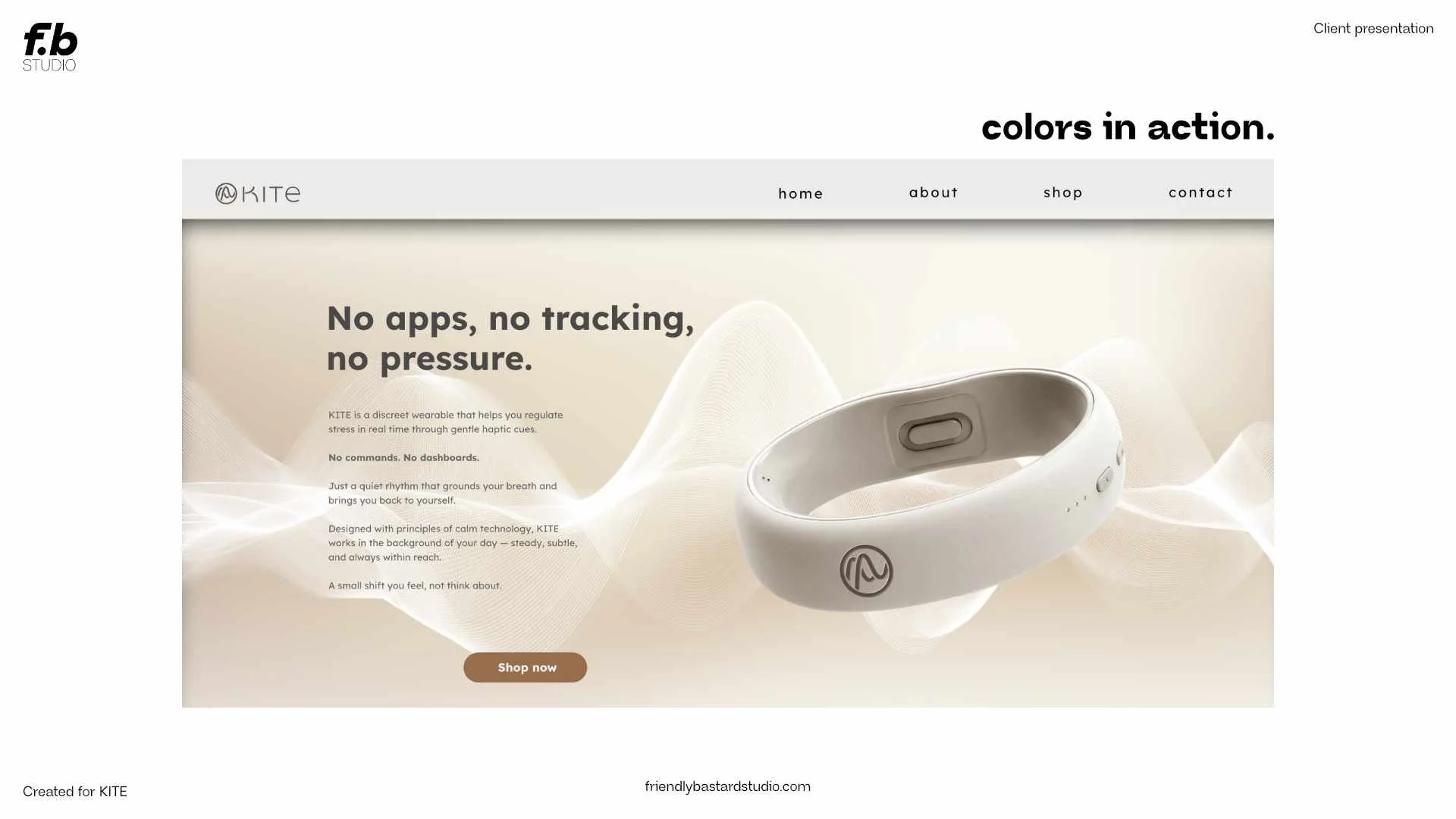
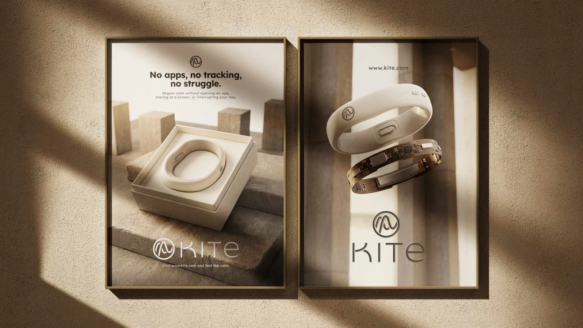
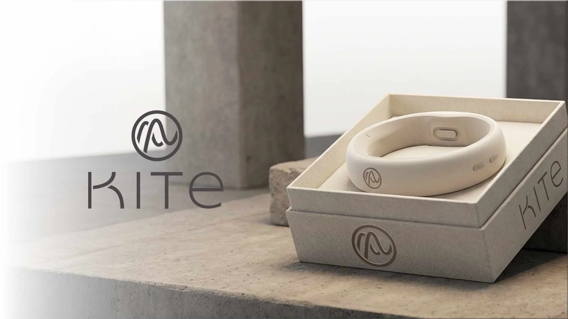
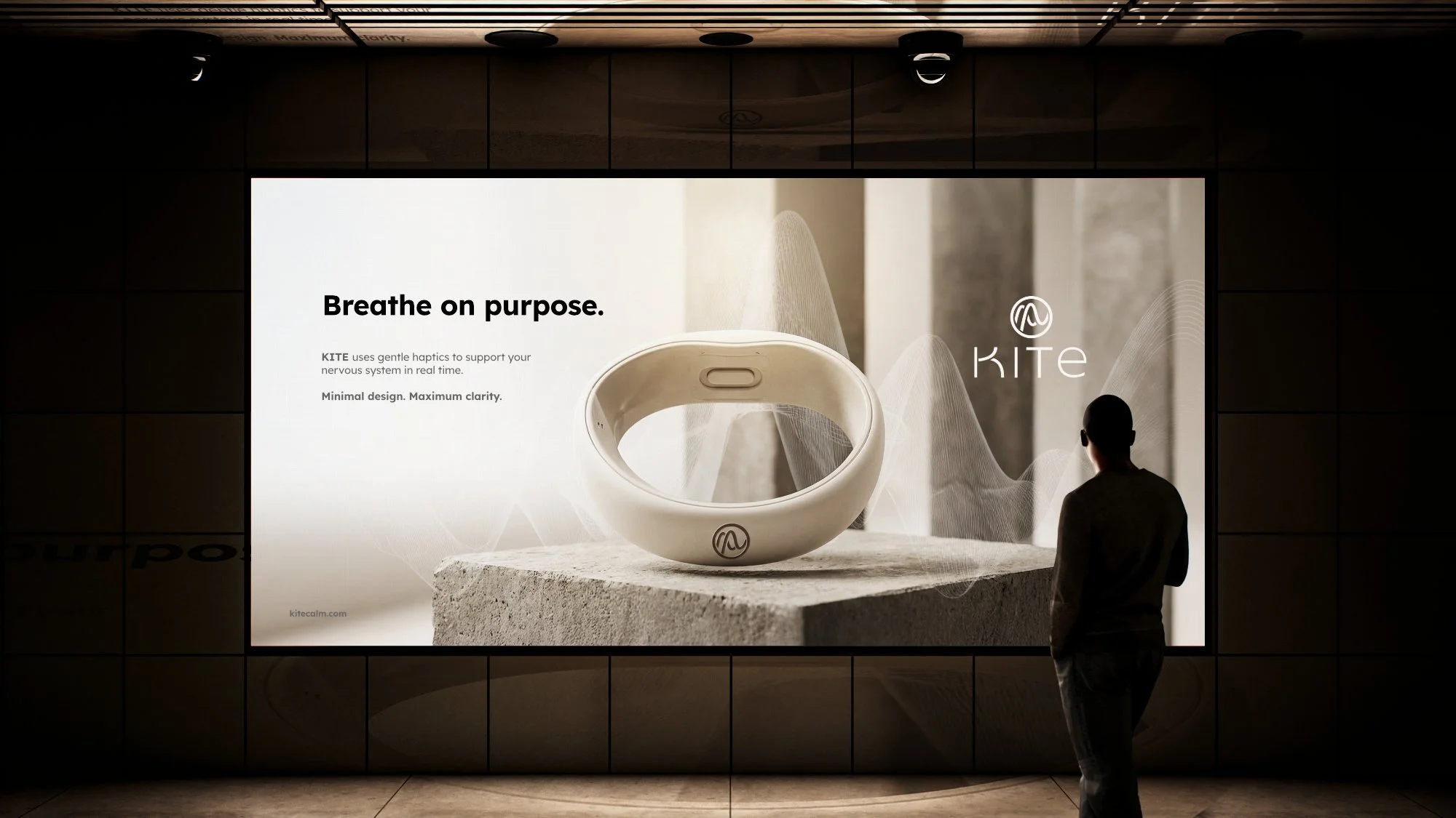
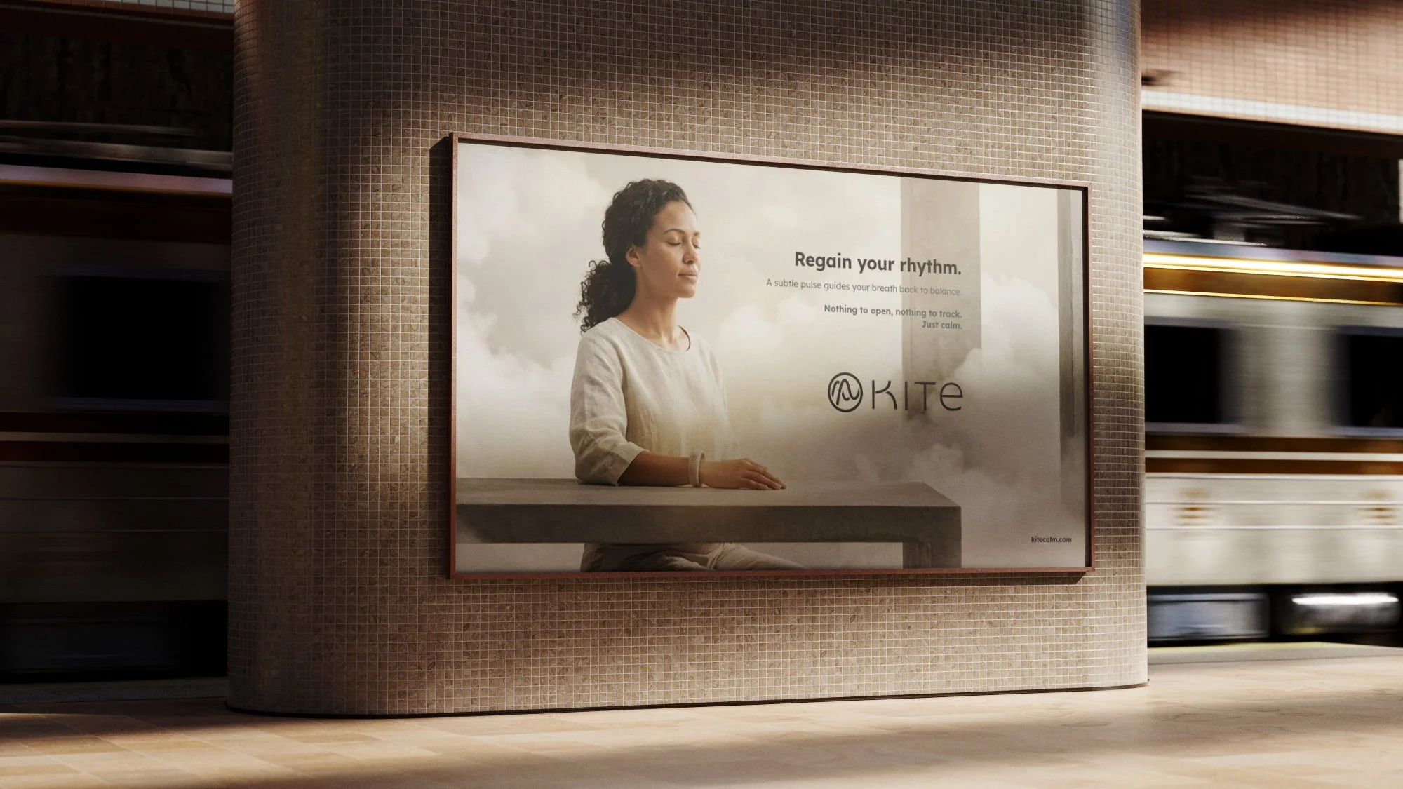
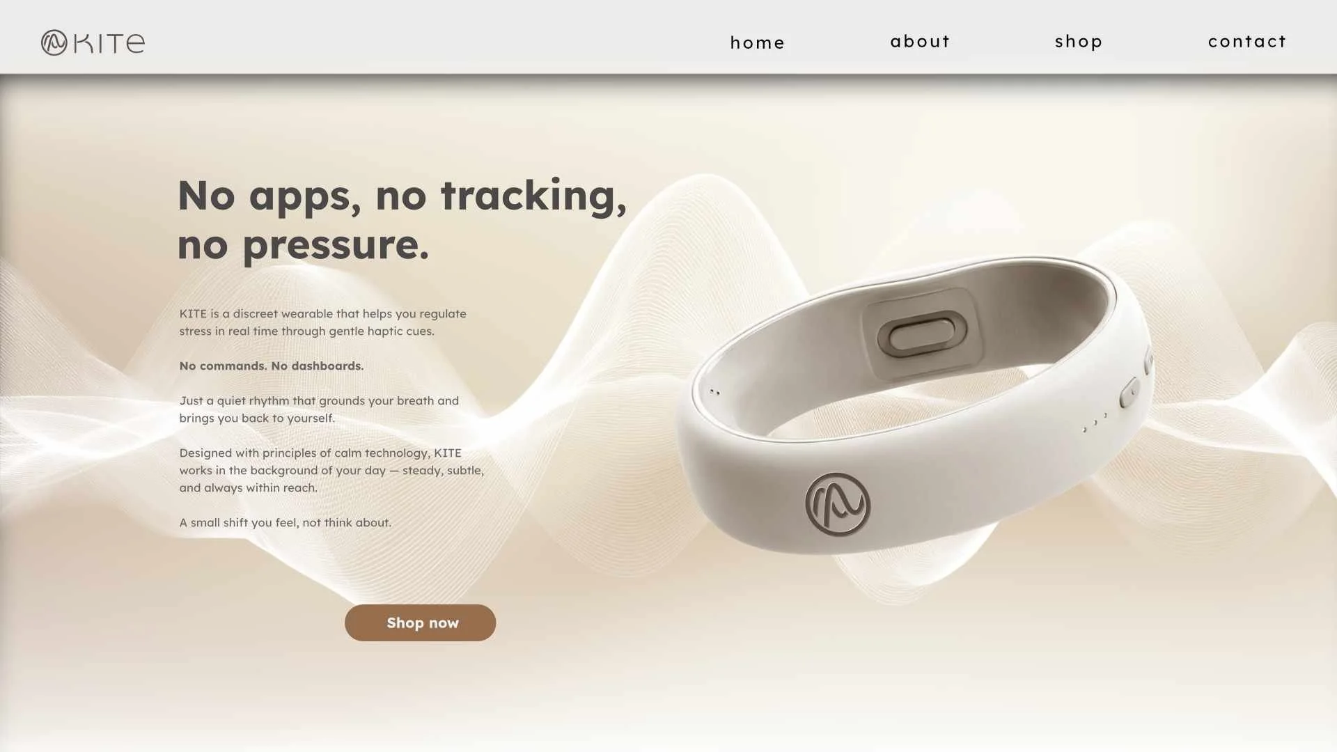
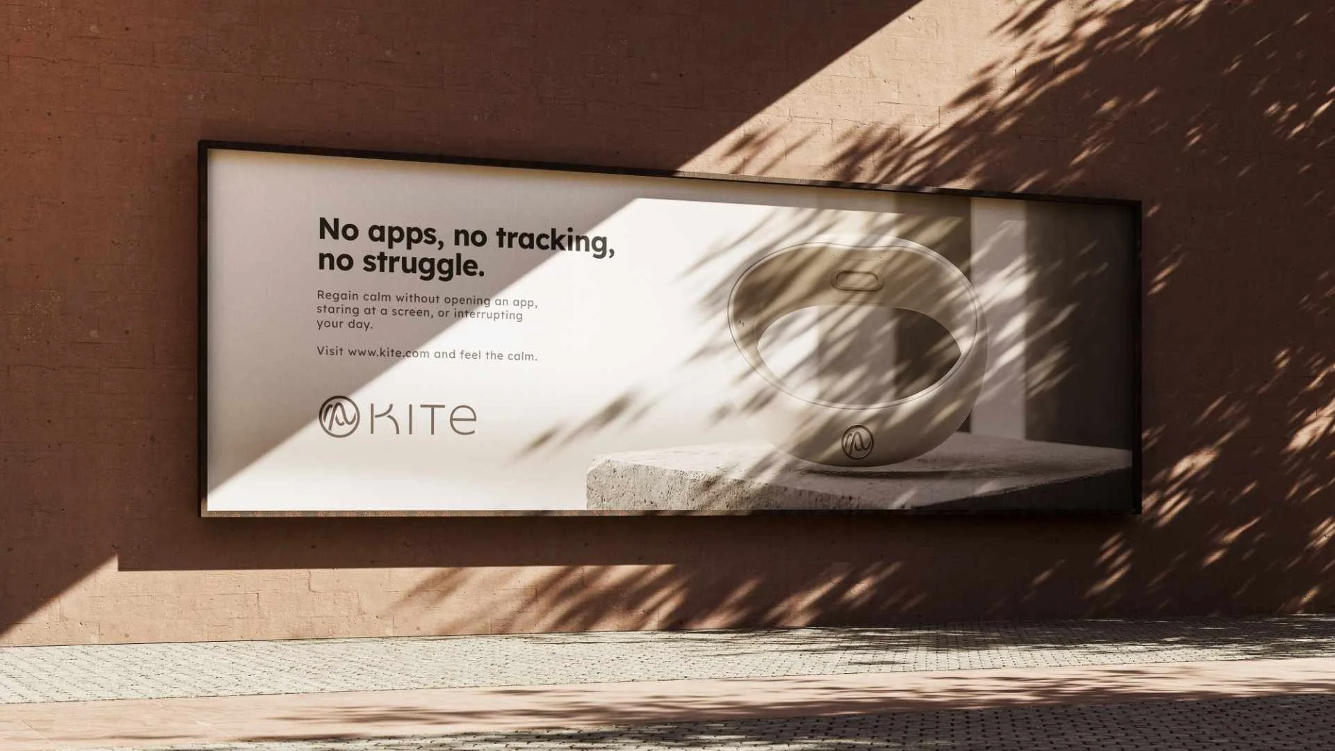
A conceptual brand identity created for KITE, a fictional health-tech wearable designed to help overstimulated professionals regain calm through subtle haptic cues and guided breathing.
This project explores minimalist visual language, from logo and color systems to iconography and brand assets, reflecting balance, continuity and clarity in service of mindful simplicity.
the direction.
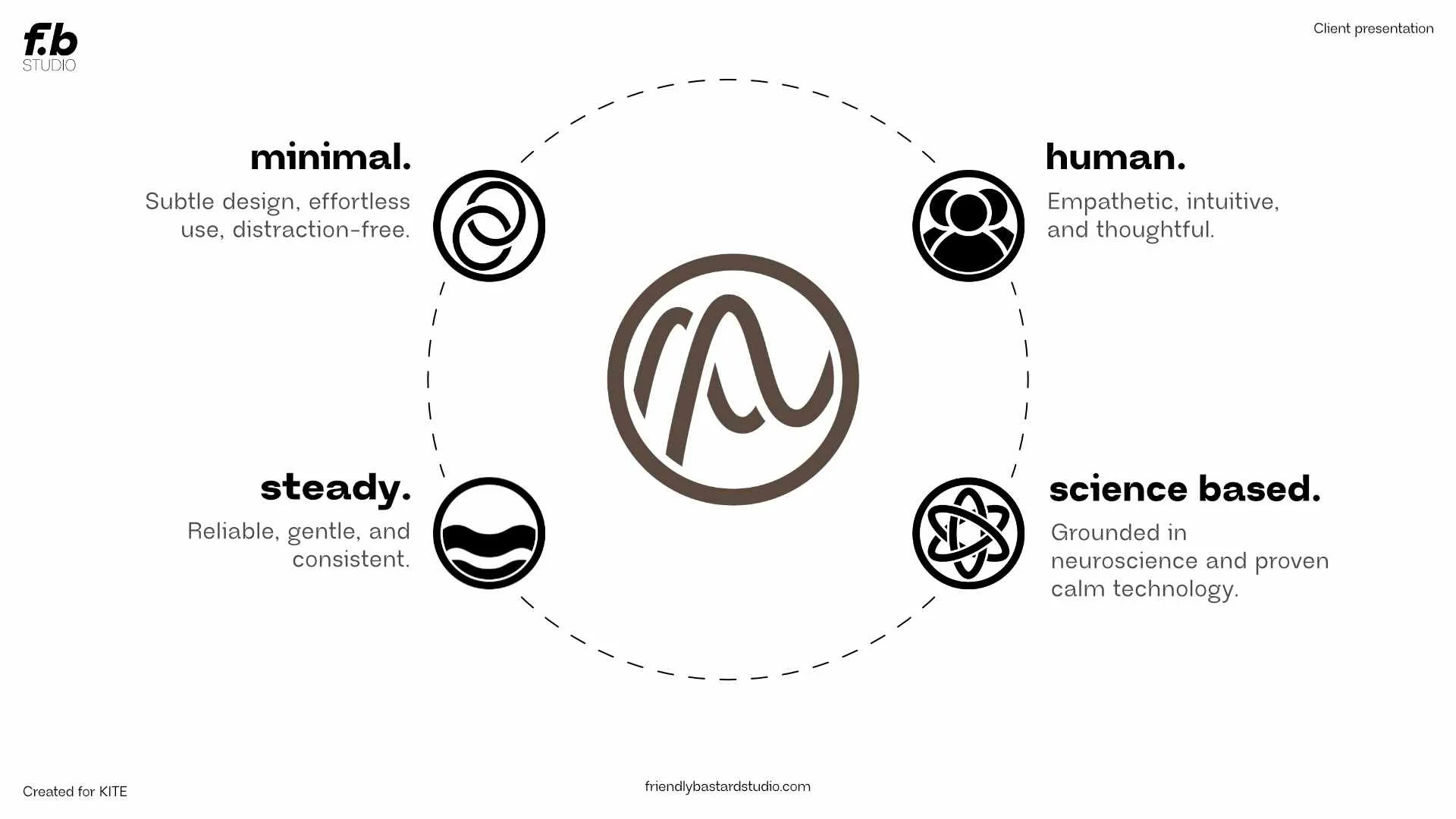
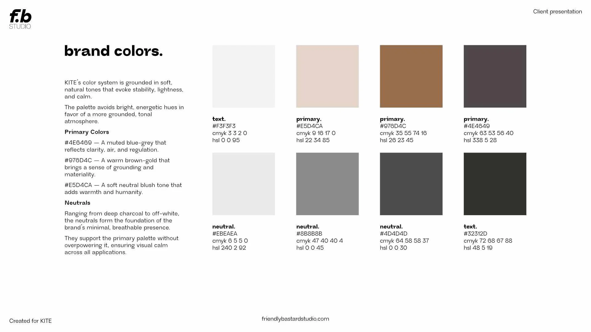
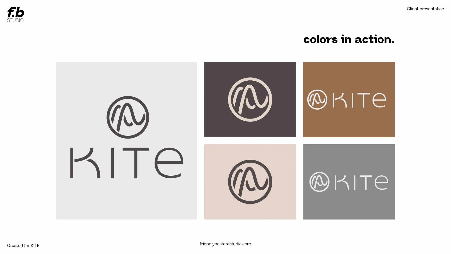
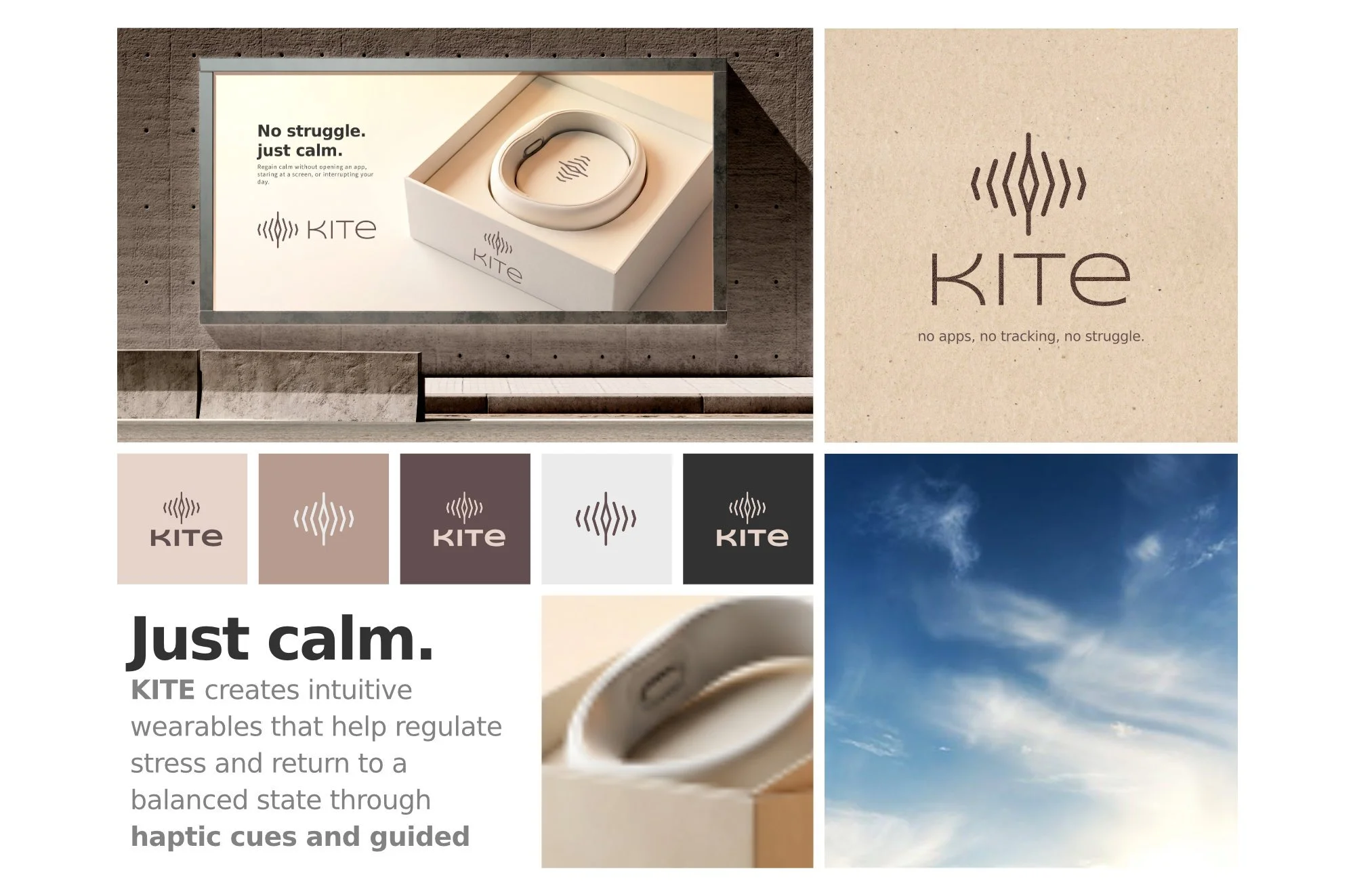
After creating multiple direction, the one chosen was most in line with the brand values and identity, due to the muted palet featuring cool browns, creams and dark greys. Using a clear and readably typeface for the headers and body copy created a sense of clarity and calm.
Later adding in human faces to the branding and the product gave a fleshed-out visual language for the brand.
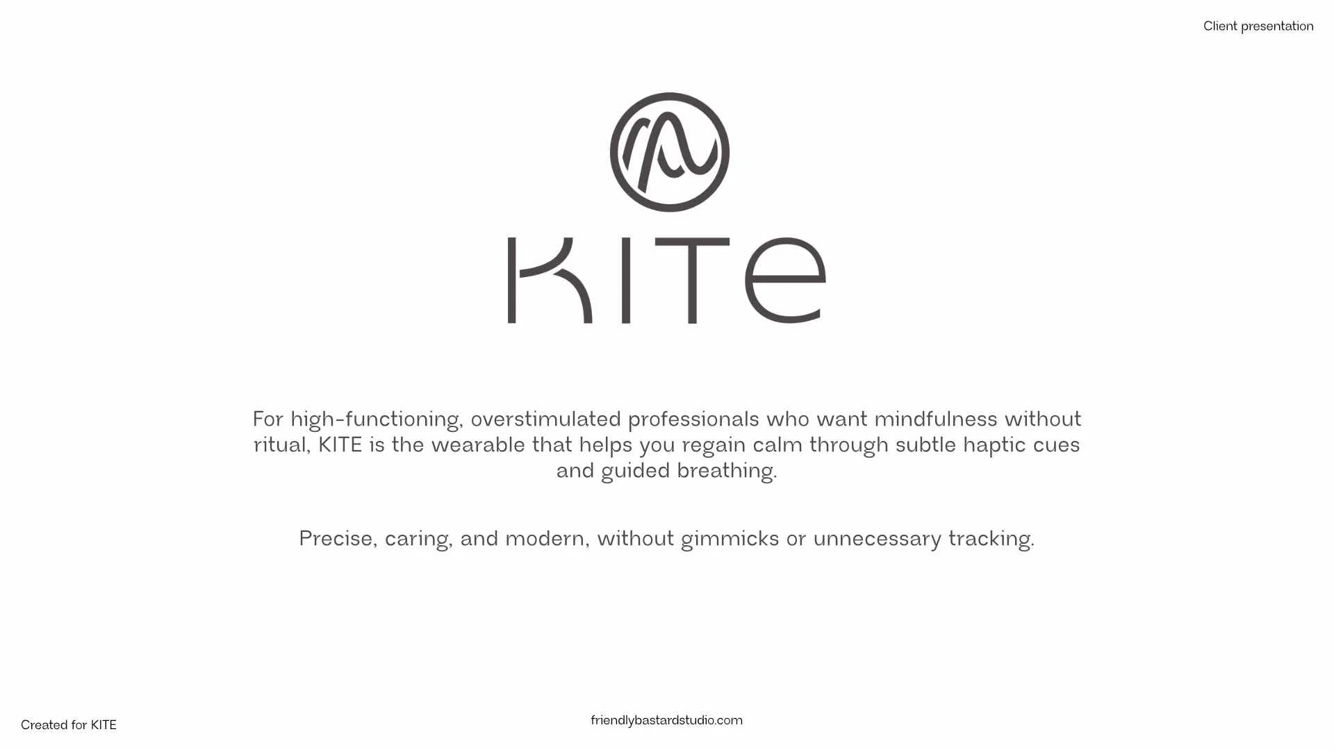
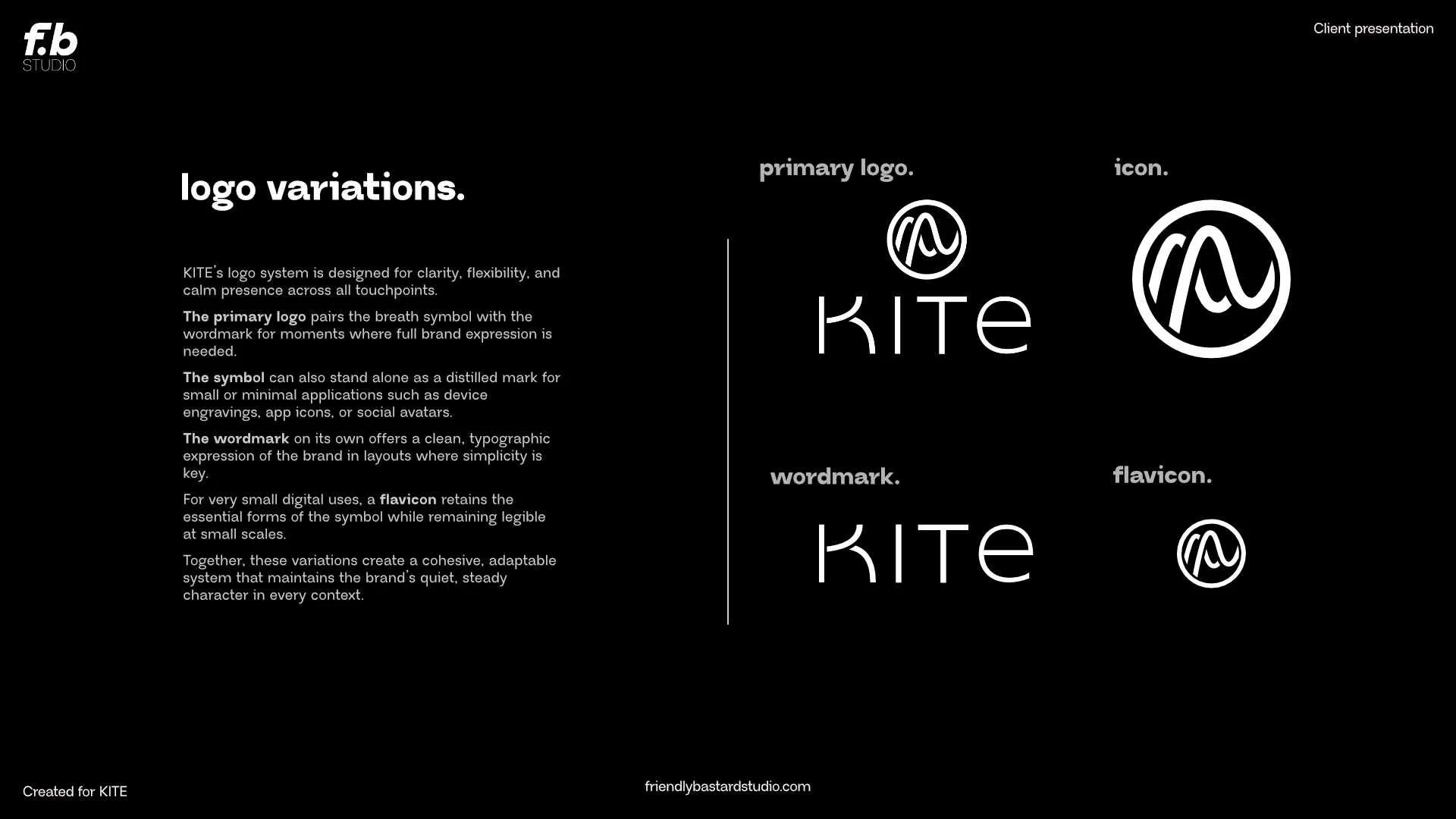
The logo had to symbolise a guided breath, and create a visual system that was flexible to use across different sizes and uses, and recognisable with and without the wordmark.
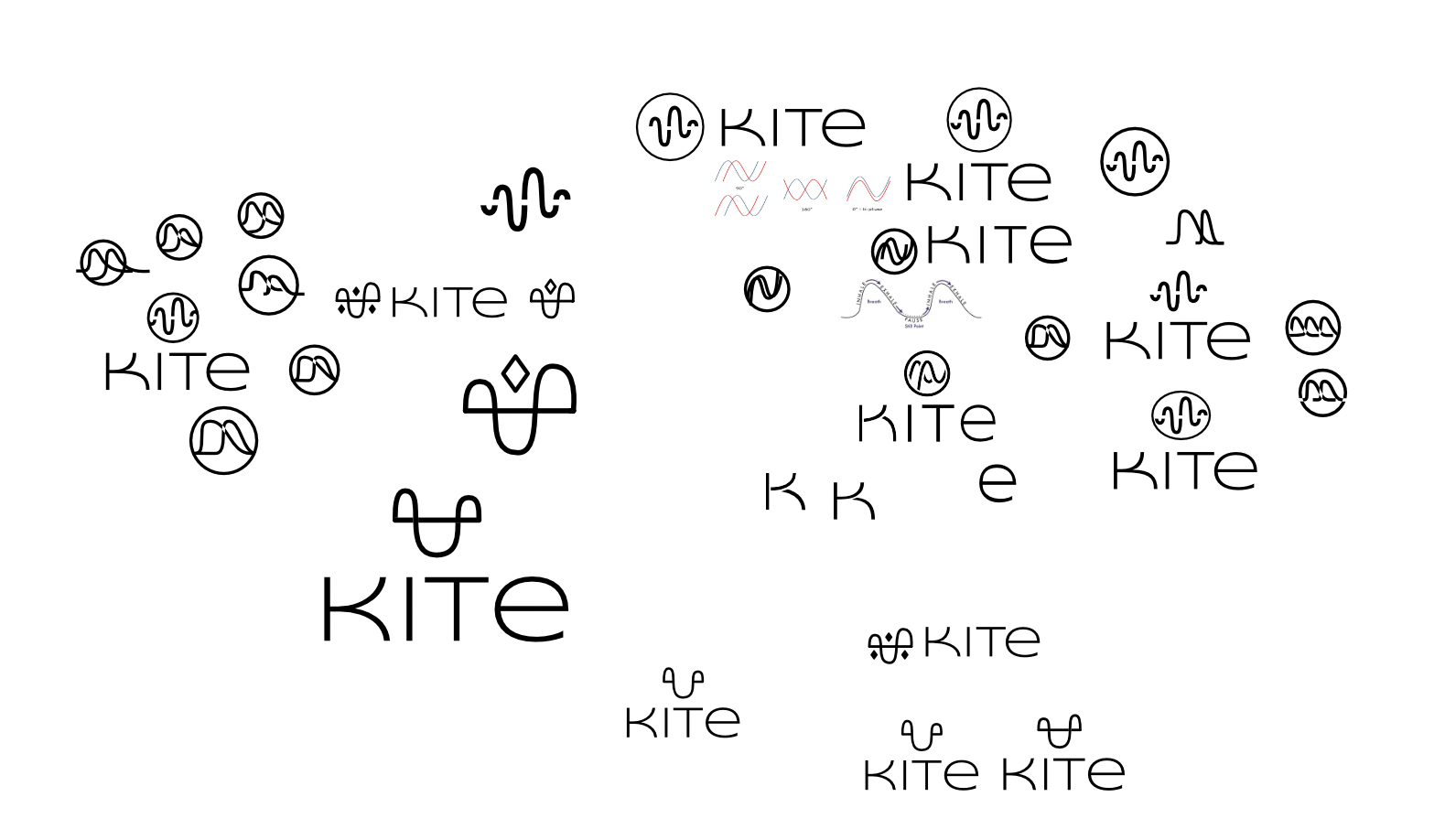
the logo design.
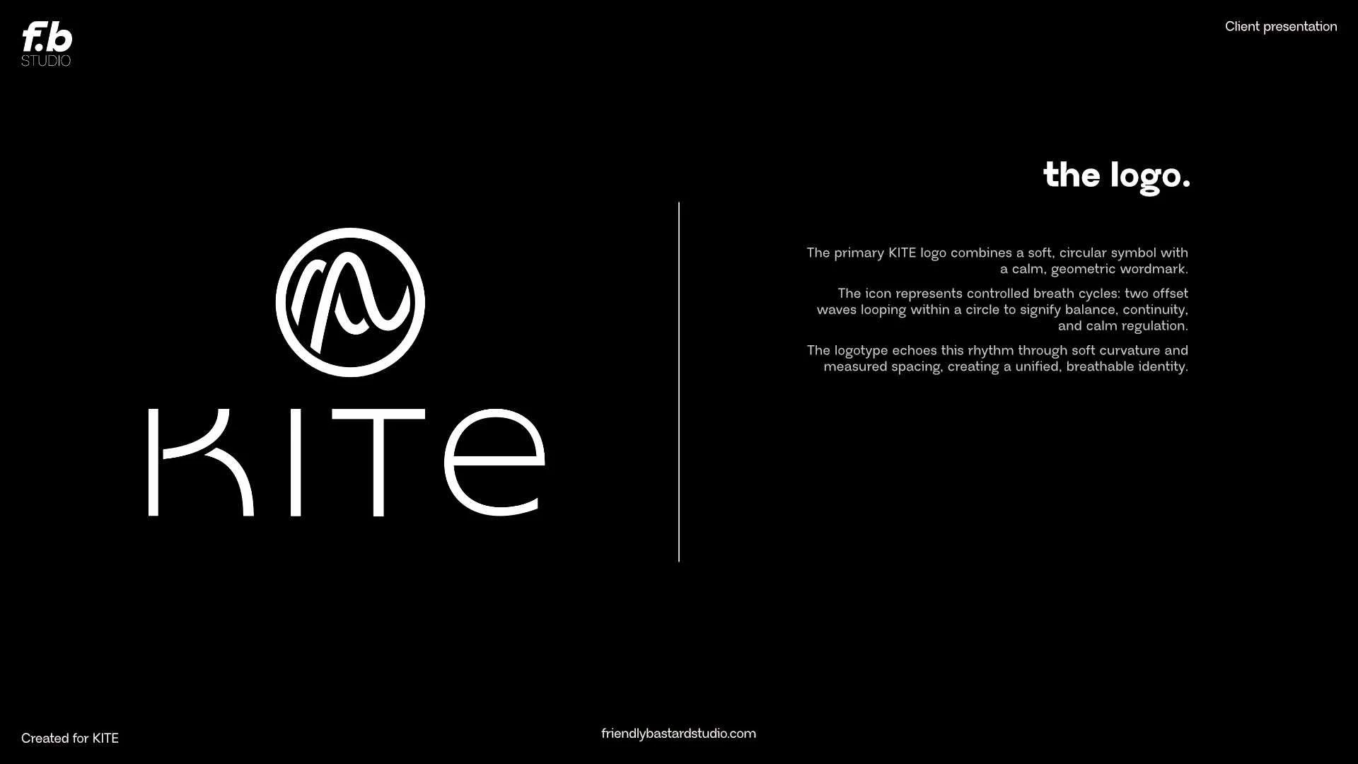
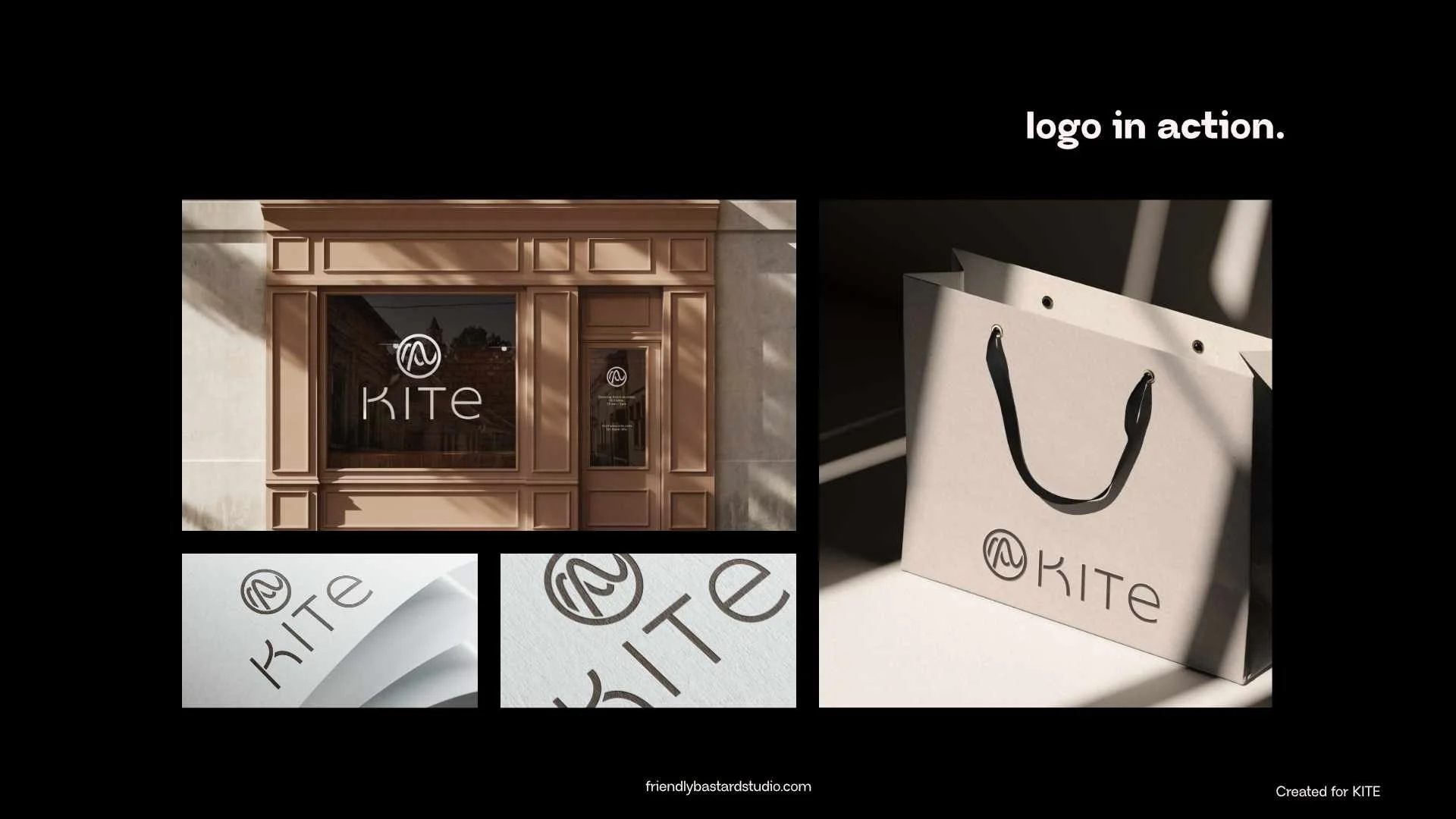
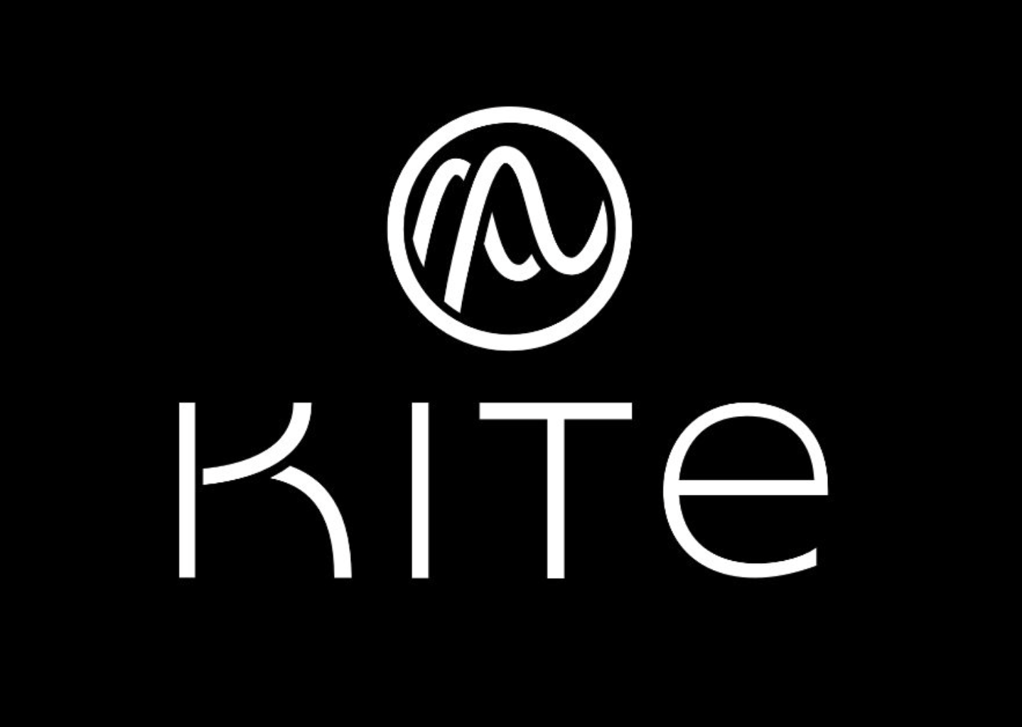
The primary KITE logo combines a soft, circular symbol with a calm, geometric wordmark.
The icon represents controlled breath cycles: t w o offset waves looping within a circle to signify balance, continuity and calm regulation.
The logotype echoes this rhythm through soft curvature and measured spacing, creating a unified identity.
The logo design process had many different iterations before landing on the final design.
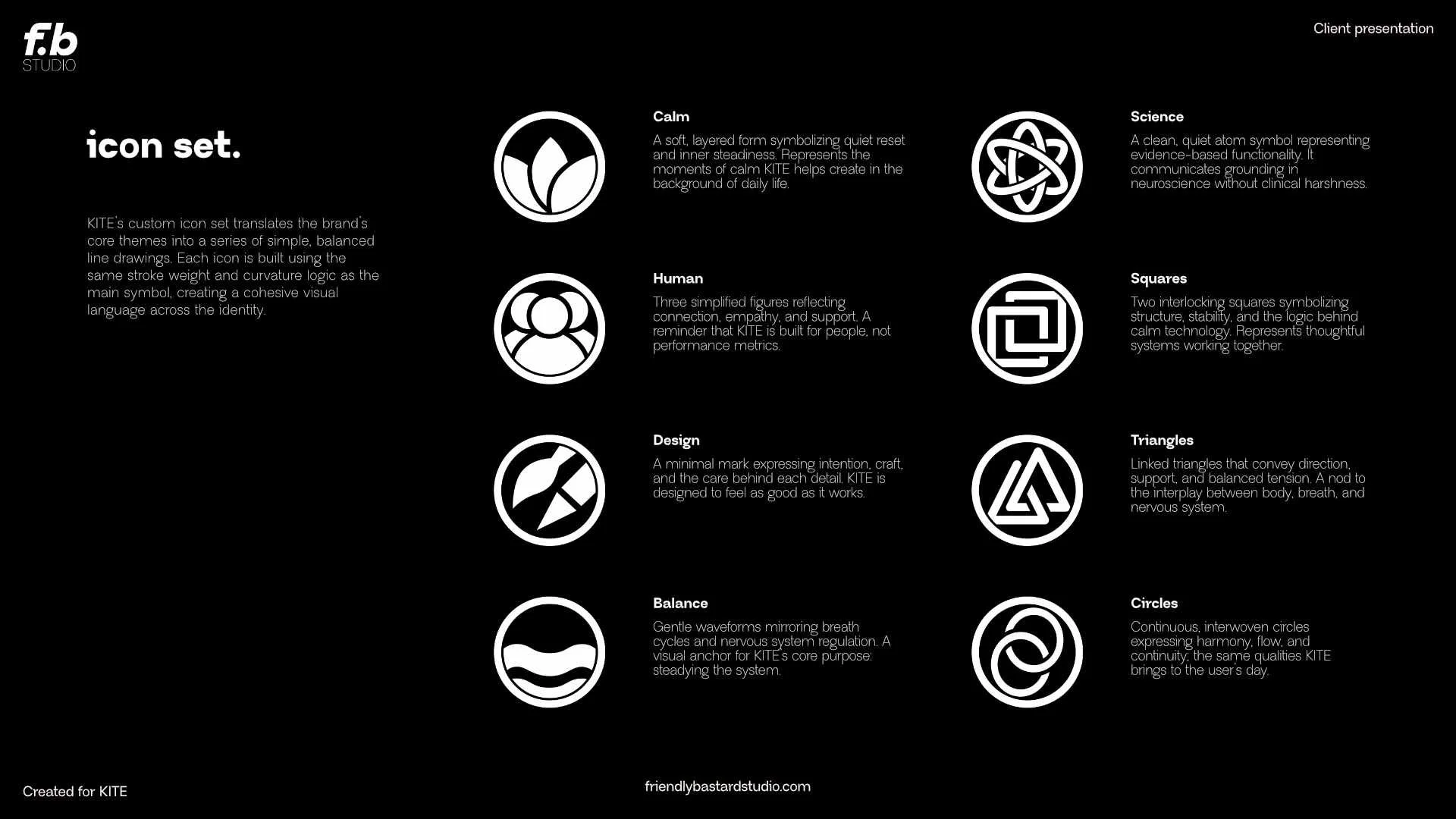
a slice of the full brand identity.