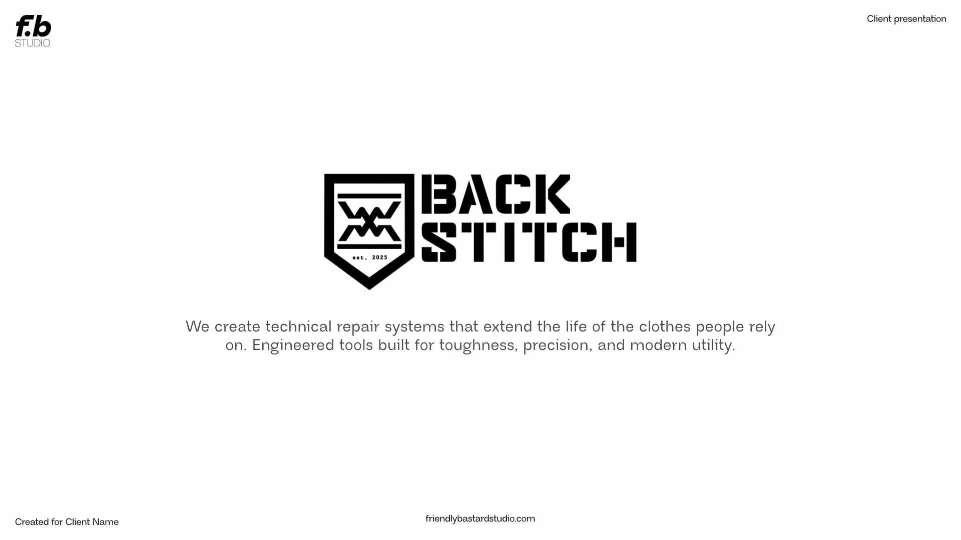
backstitch.
Project type Concept branding & identity design
Client Backstitch (Fictional brand)
Date 2025
Tools used Midjourney, Photoshop, Affinity 3
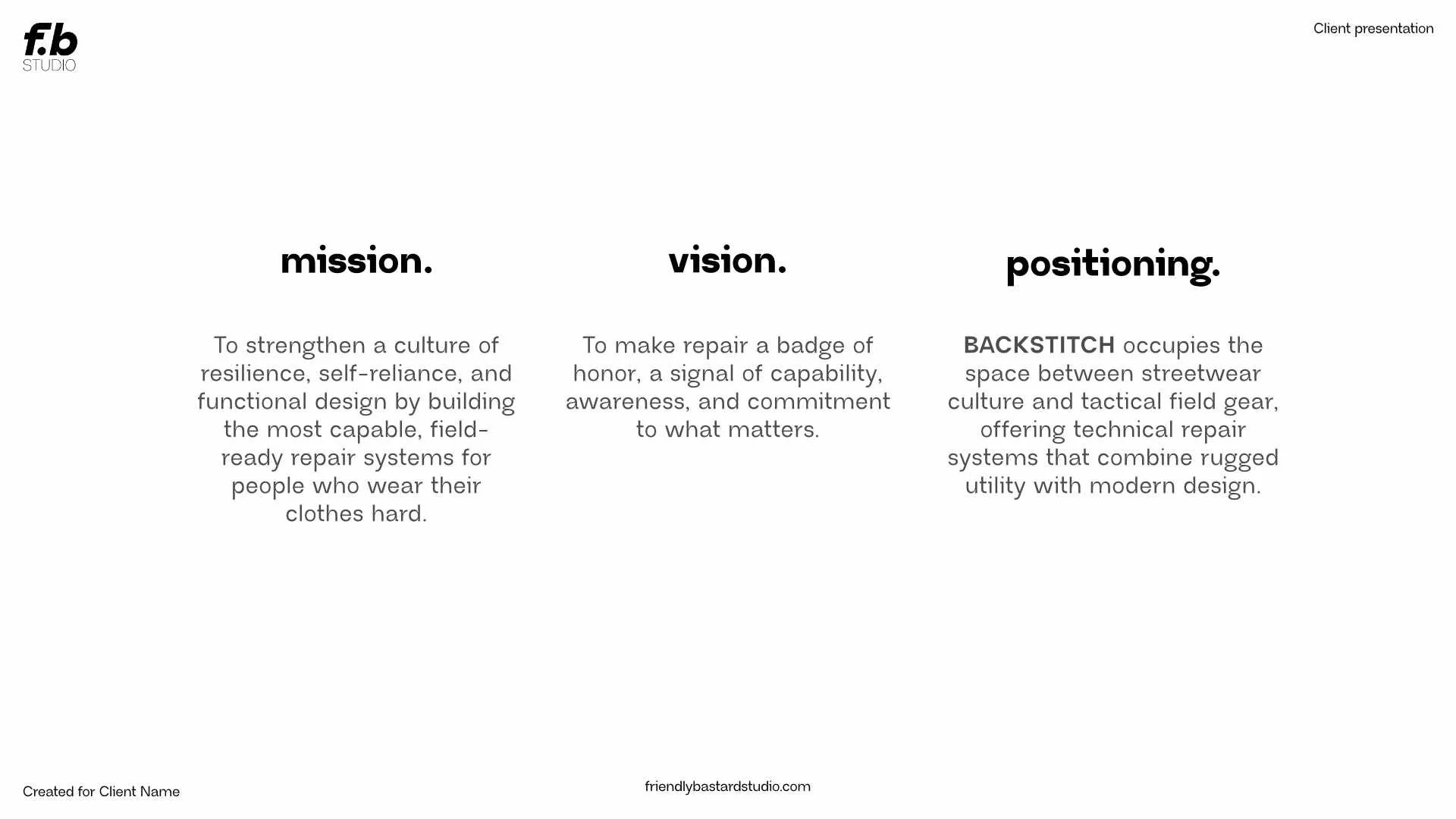
Project goal Create new brand identity for fictional tool kit company Backstich
the project.
(full brief below)
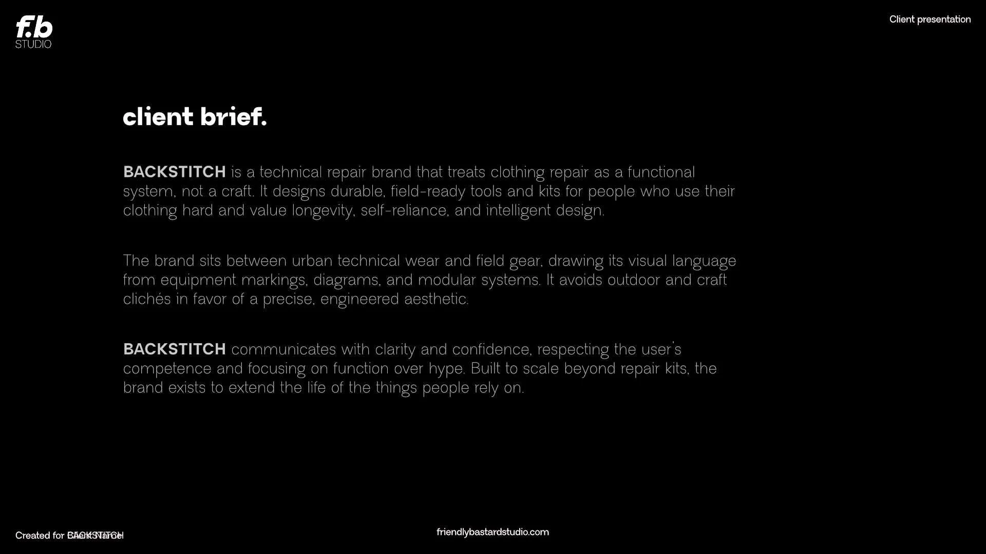
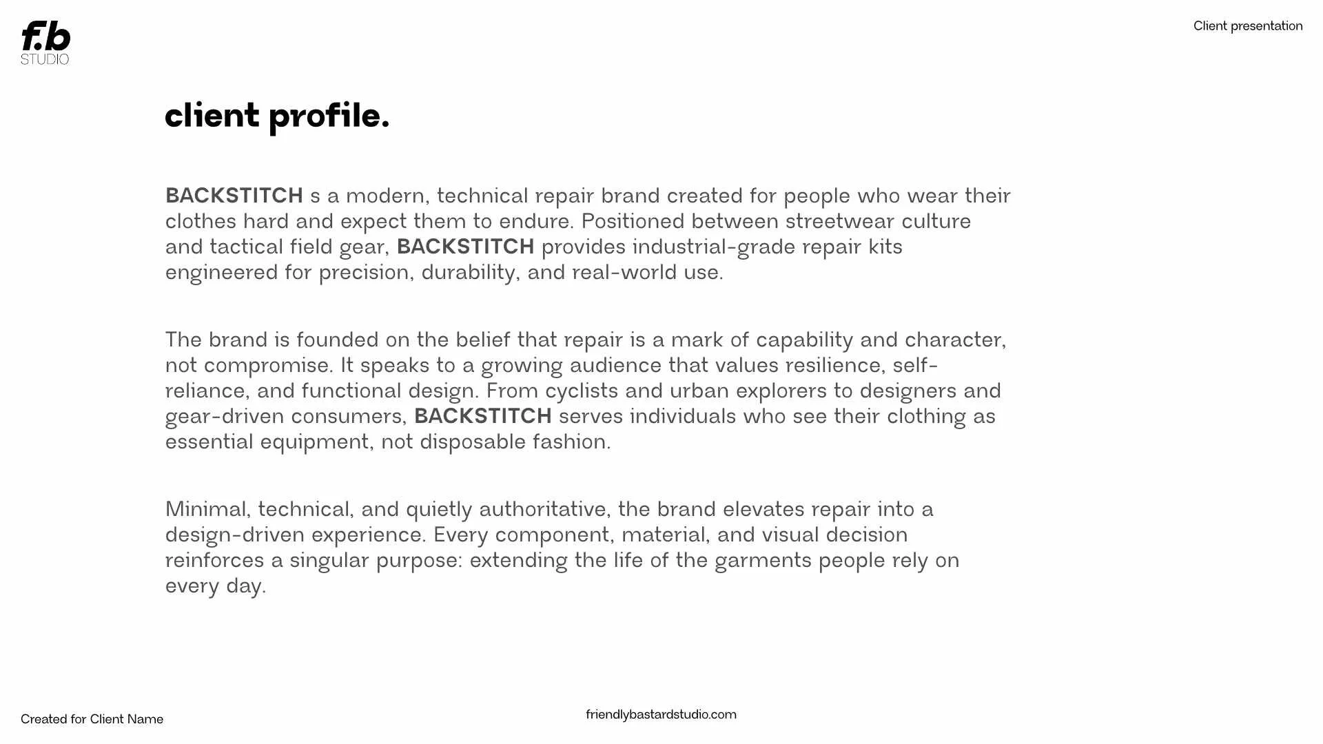
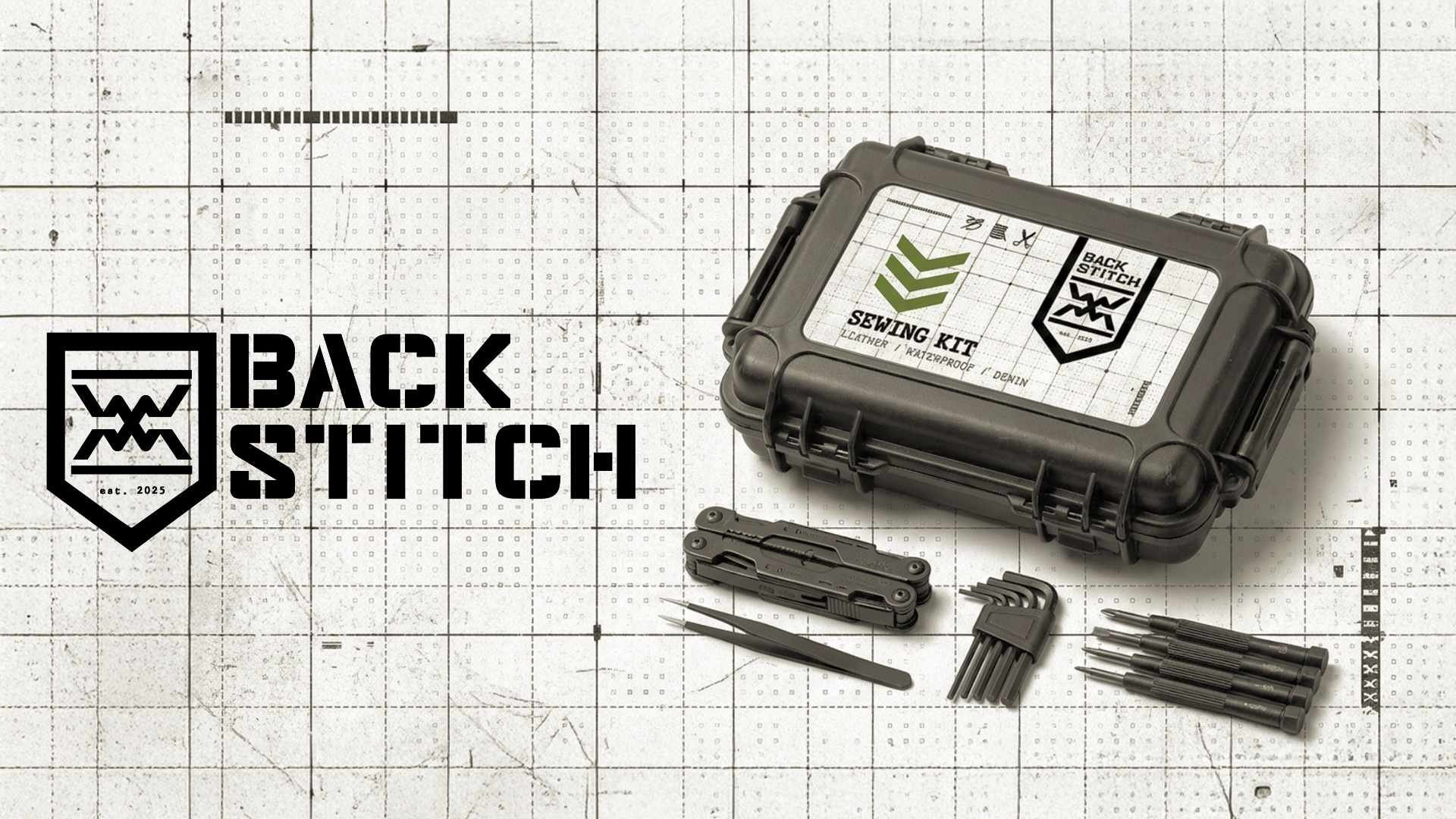
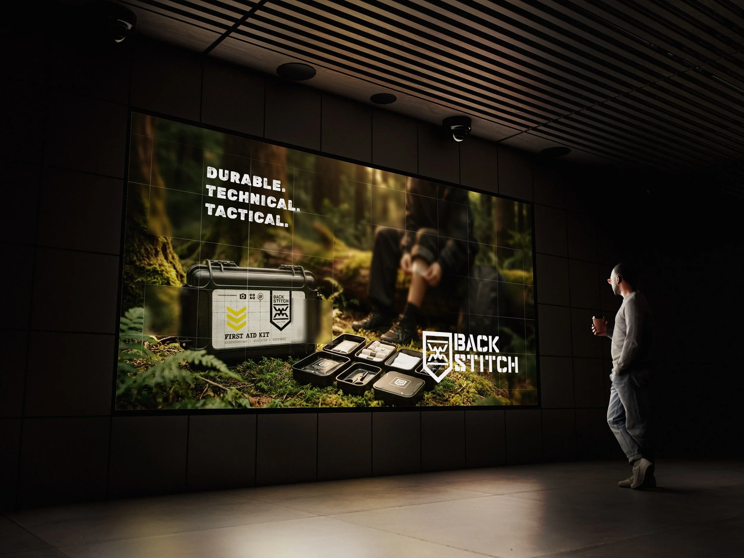
A conceptual brand identity developed for Backstitch, a fictional toolkit company focused on engineered, long-lasting repair systems for clothing and gear.
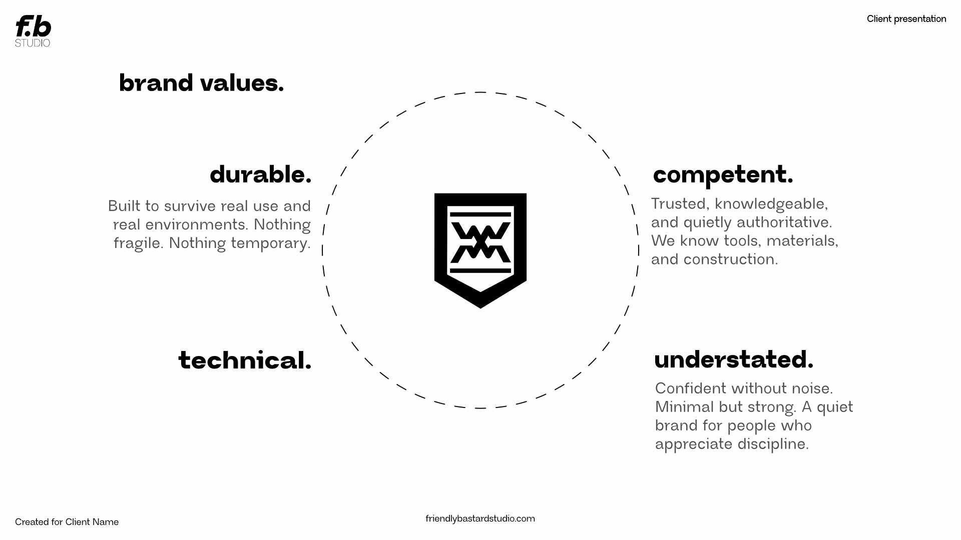
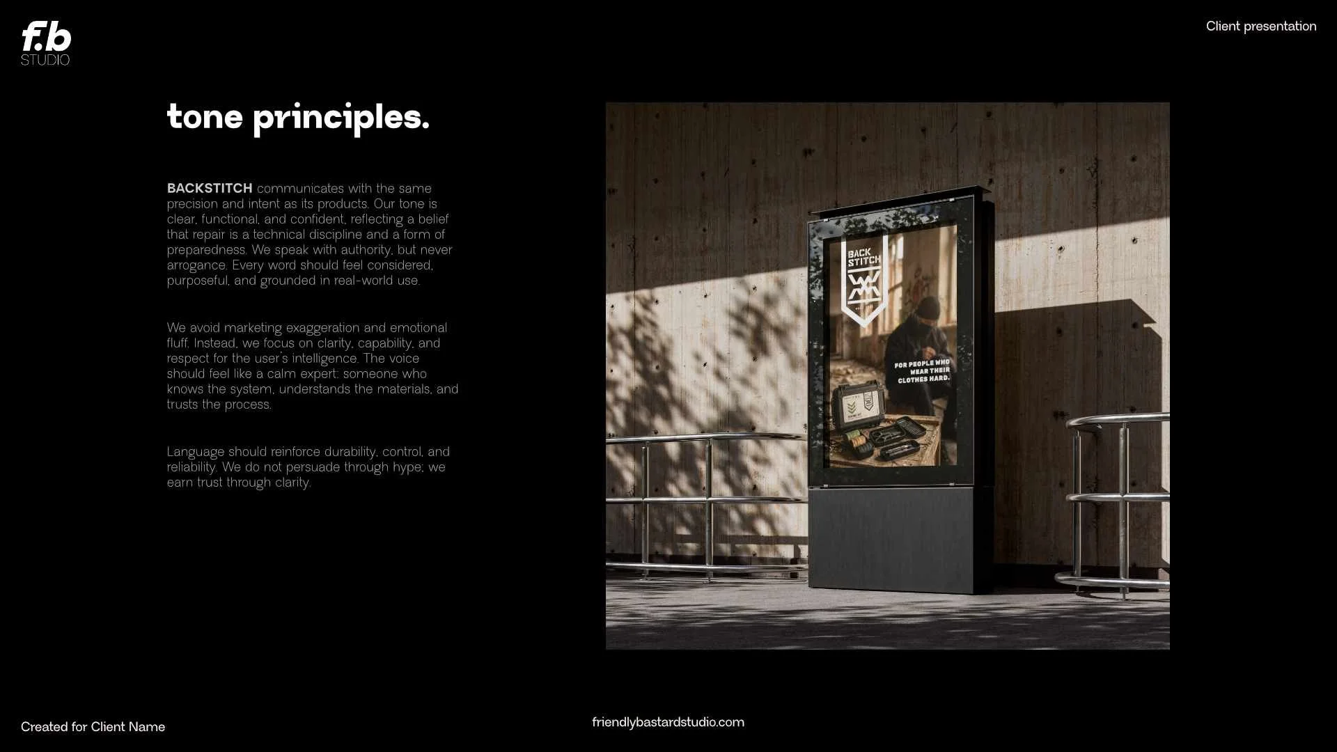
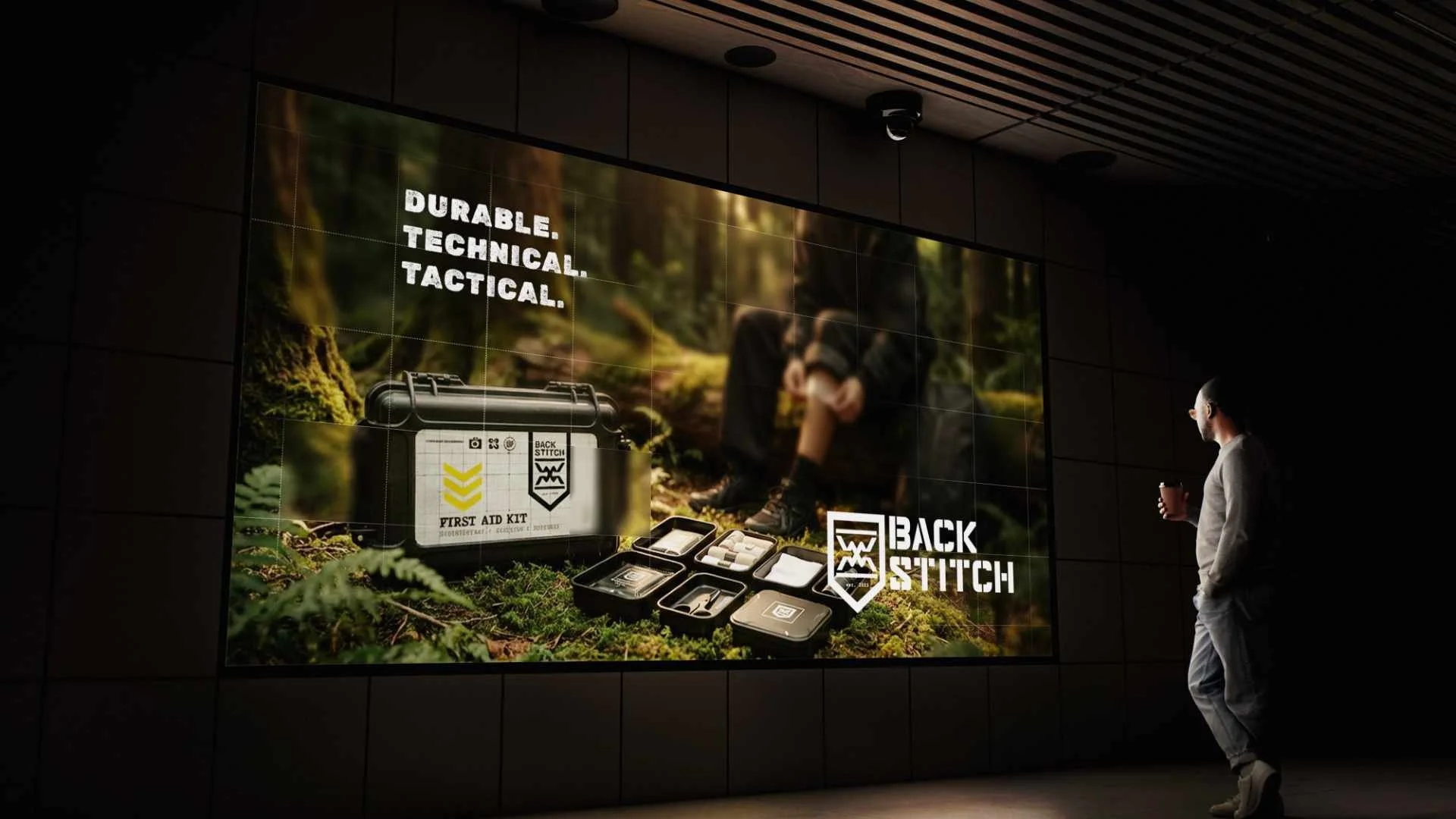
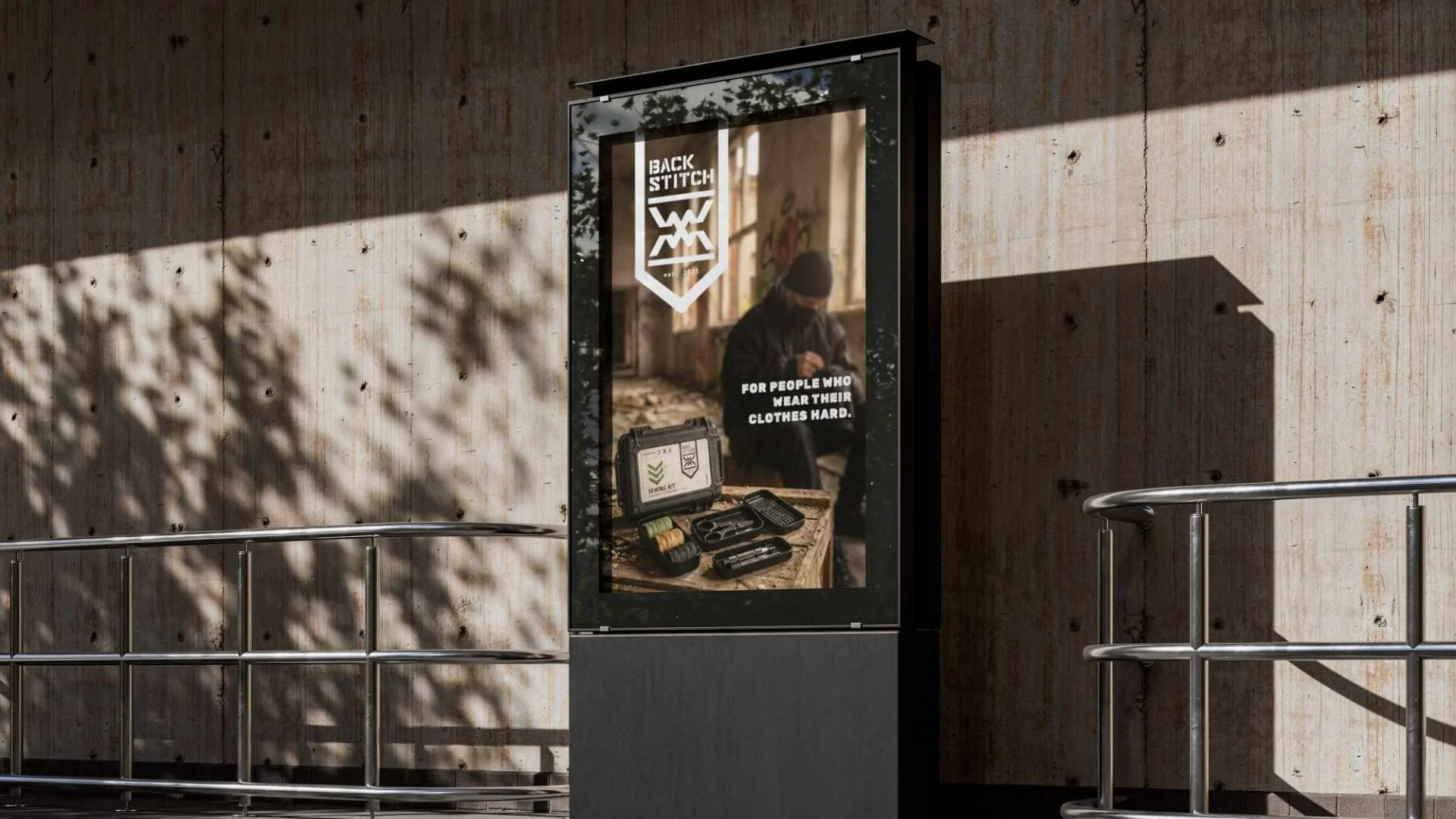
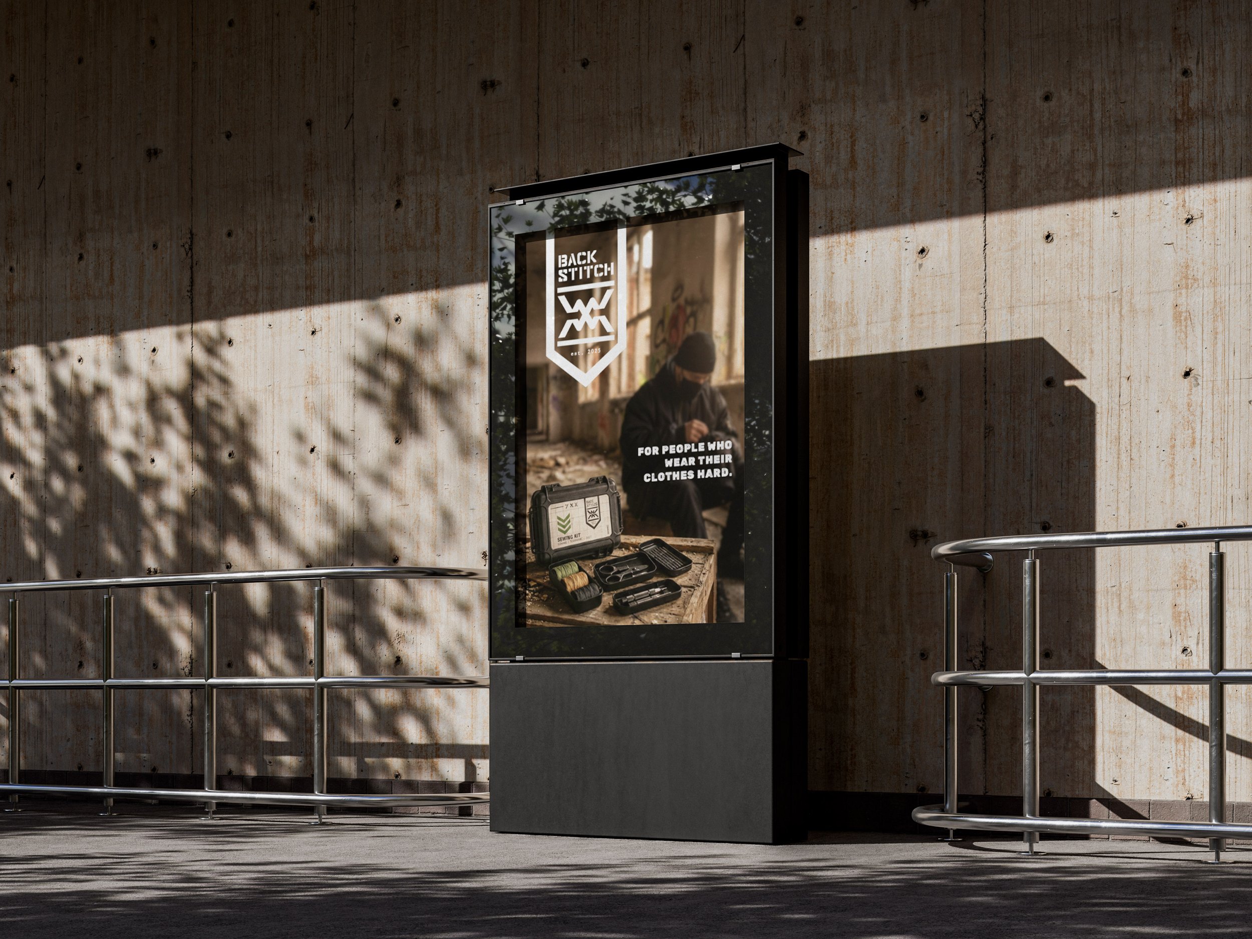
This project explores two visual directions: one grounded in rugged technical functionality and the other in urban style and customisation. It also defines a flexible logo system that communicates durability, precision and purposeful design and works across media like billboards and packaging.
direction 1.
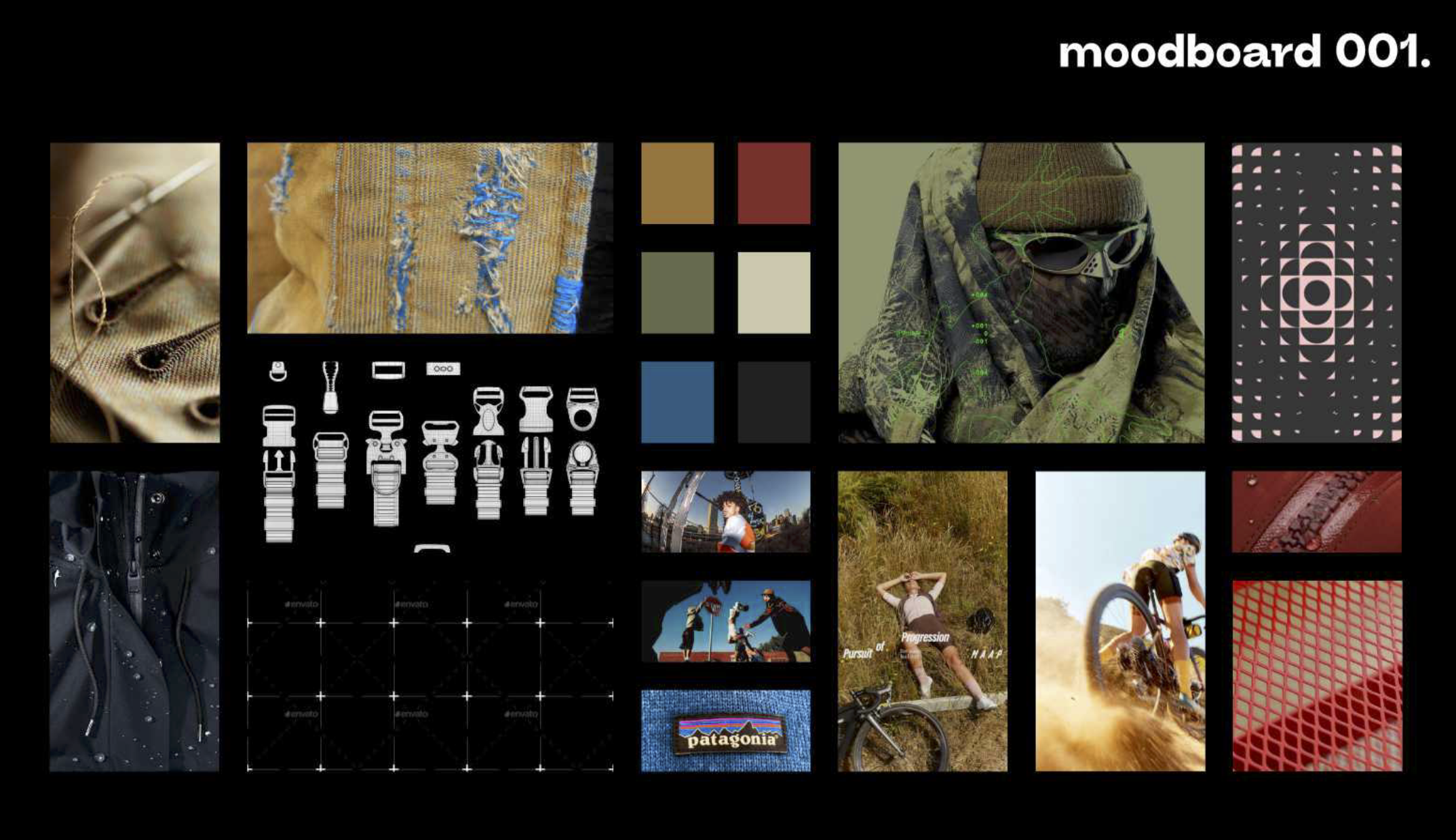
This first direction focusses on lifestyle, durability, technicality and adventure. Slighty worn, earthy tones define the palet, the "fix-it lifestyle" is heroed mainly by cyclists, athletes and sport players in photography. This direction is all about understated functionality and human precision.
Tagline:
Competent. Technical. Understated.
direction 2.
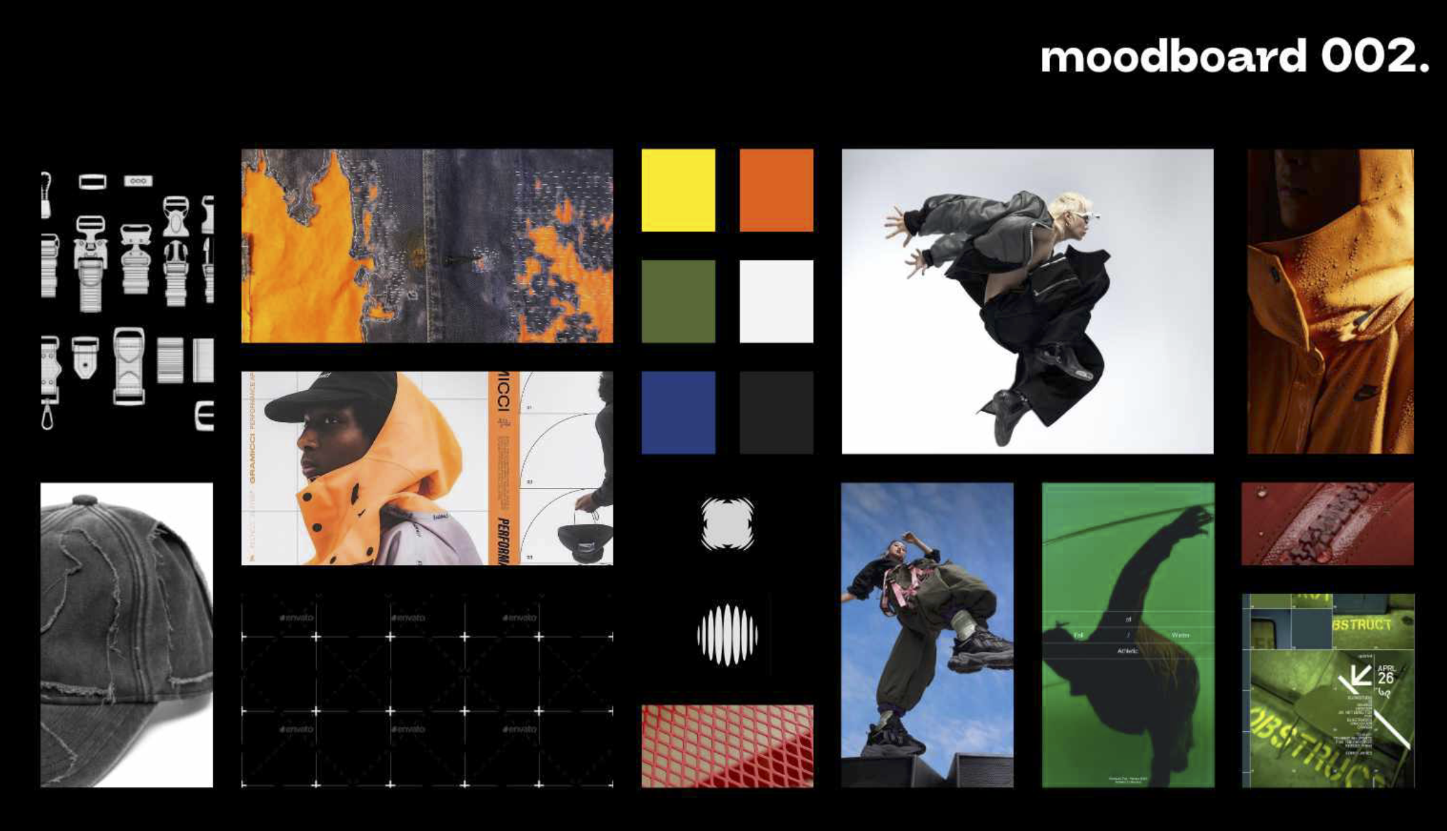
This direction focusses more on the style side of the brief. Custom repairs with cool effects, heavy on style and customisation. Bright, industial color palette paired with off whites greys and blacks. Target audience mainly geared towards urban explorers, creatives and streetwear lover.
Tagline:
Live with style, precision, and zero compromise.
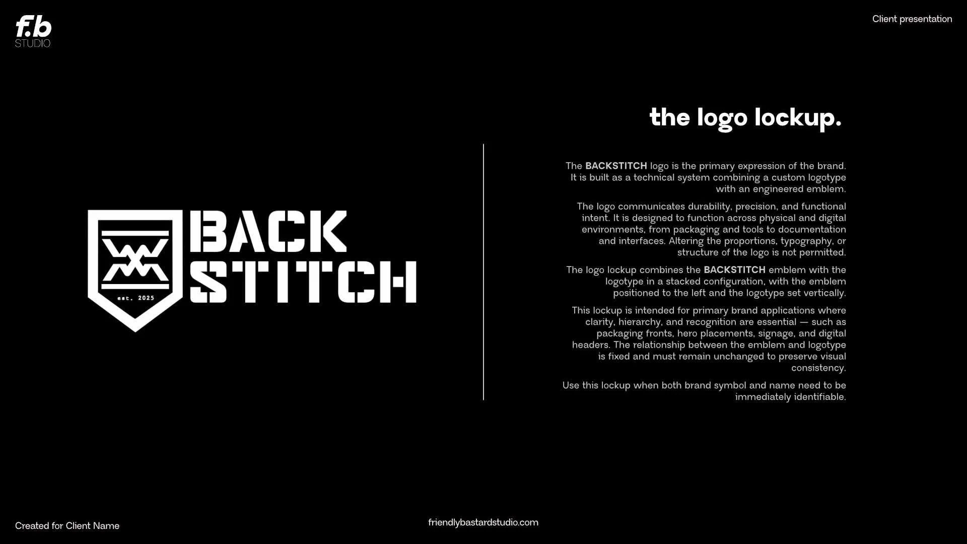
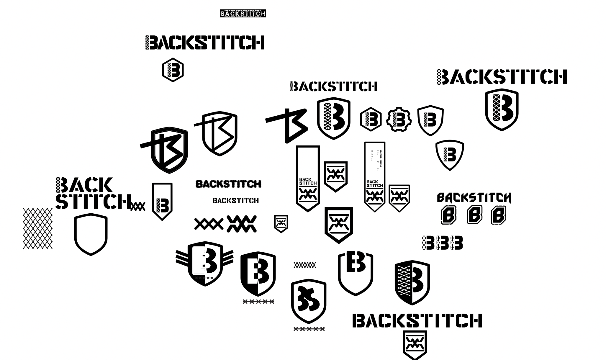
the logo design.
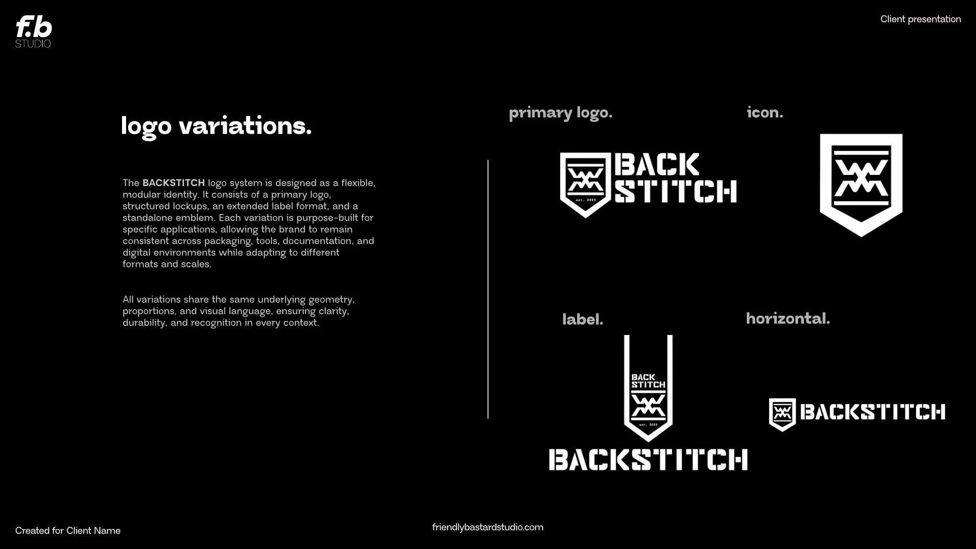
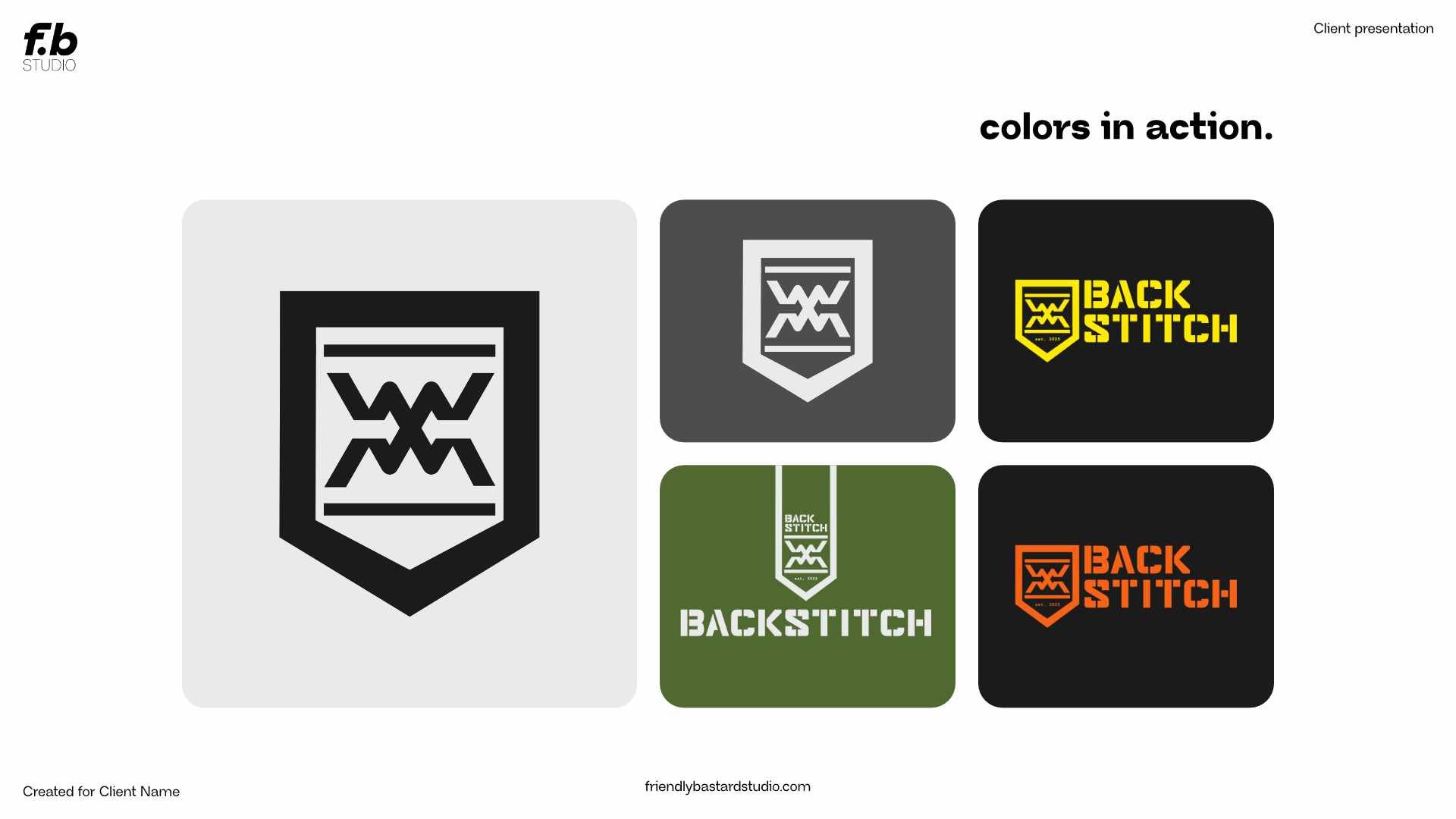
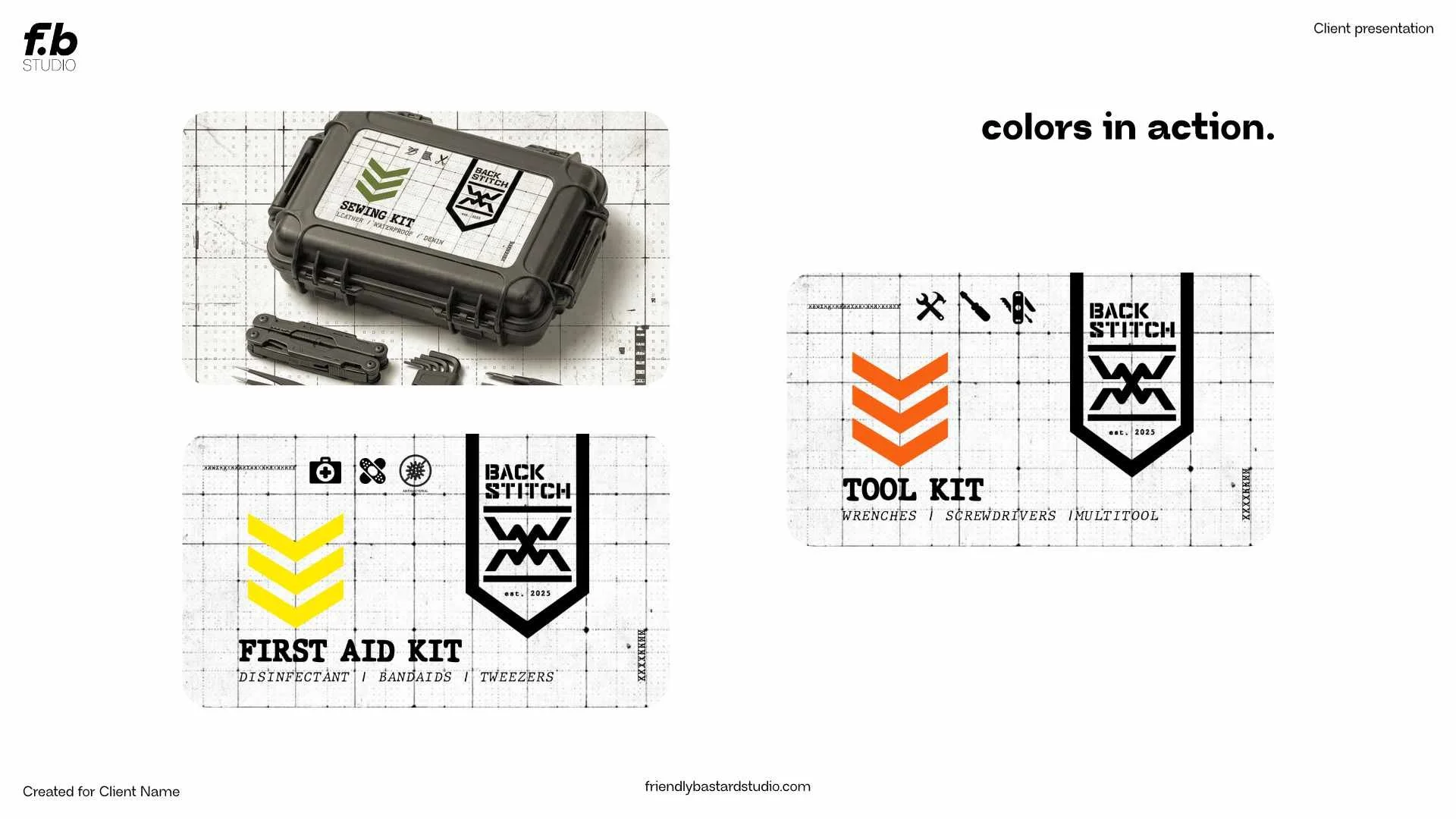
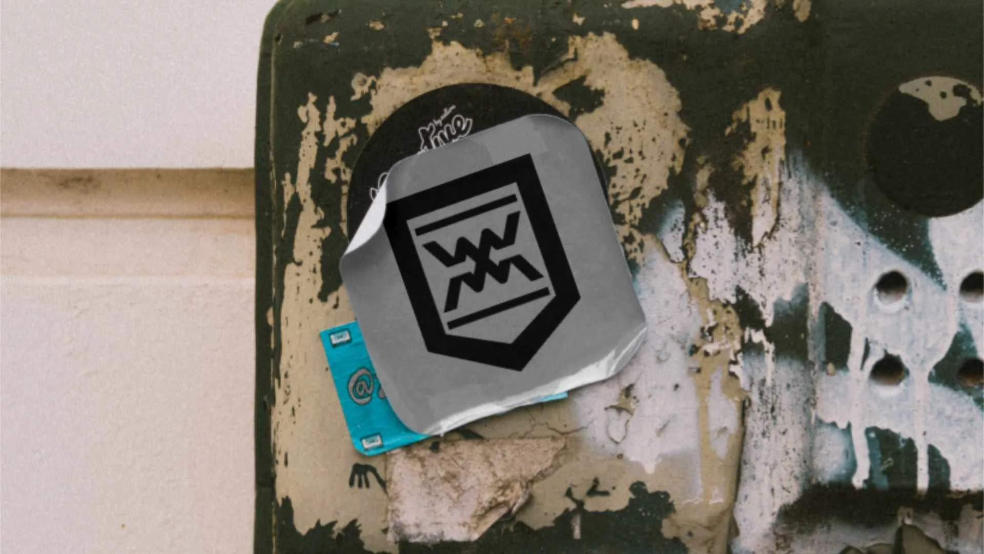
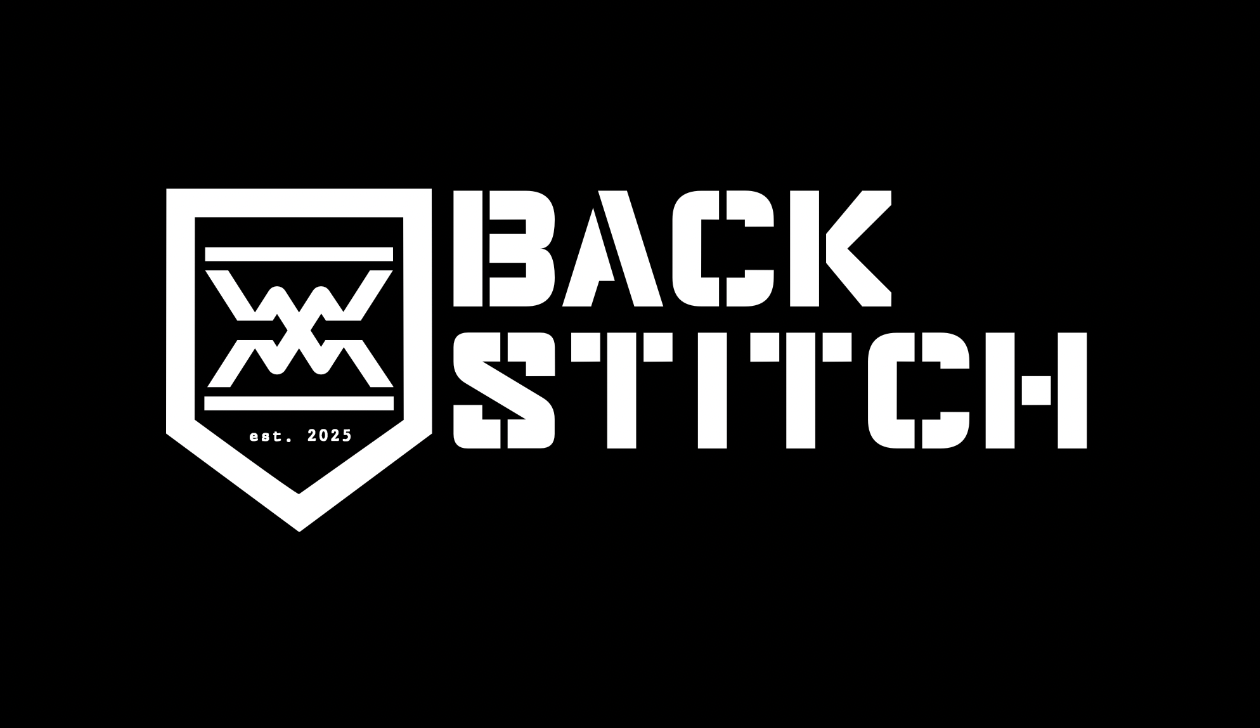
The BACKSTITCH logo is the primary expression of the brand. It is built as a technical system combining a custom logotype with an engineered emblem.The logo communicates durability, precision, and functional intent.
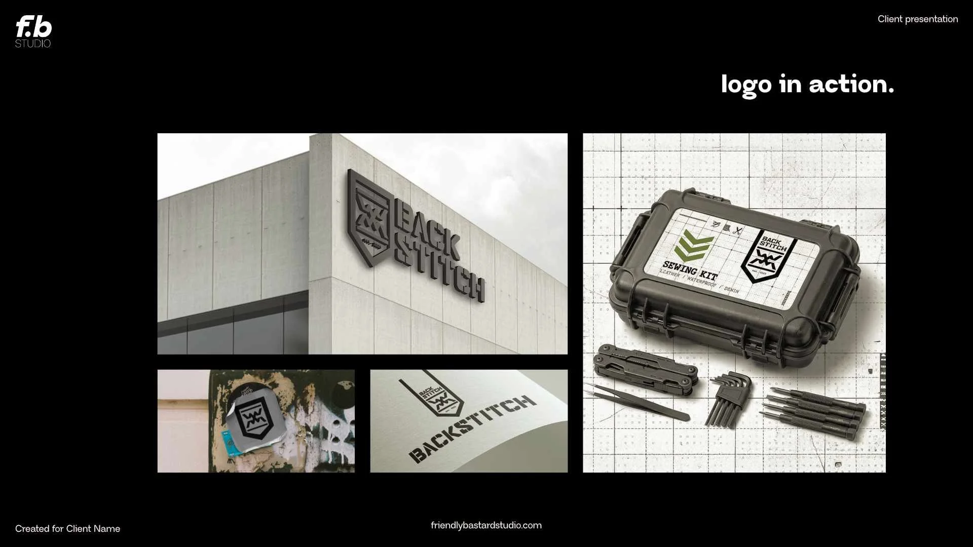
The full system, made up of a main lockup and 3 extra variations, is designed to function across physical and digital environments, from packaging and tools to documentation and interfaces.
a slice of the full brand identity.